Work / Unived
Unived Nutrition that shows its working.
Ninety-one vegan sports and daily nutrition formulations, every batch independently tested before release. The storefront concept is built around a single idea: that every claim on the pack should be one you can look up before you open it.
- Client
- Unived
- Industry
- Sports and daily nutrition
- Range
- 91 formulations
- Scope
- Storefront design concept
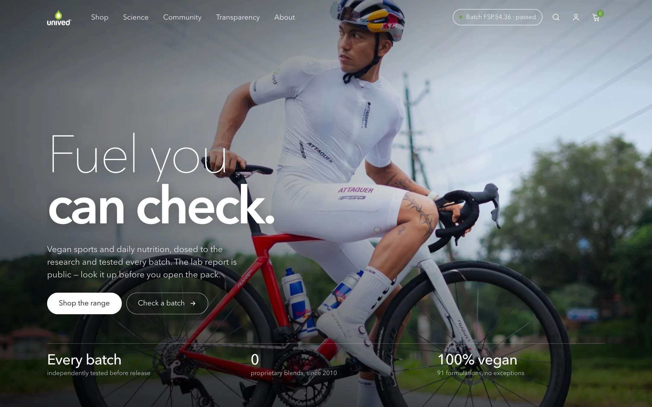
Every supplement brand says the same things. Almost none can prove them.
Clean label. Third-party tested. No fillers. Every competitor on the shelf makes some version of that promise, which means the promise itself has stopped selling anything.
Unived has had the receipts since 2010: a lab report for every batch and no proprietary blends, ever. The concept spends its design budget on turning that into something a customer can act on. Put the batch code in the header, live on every page. And build the page around the dose rather than the product, because an endurance athlete is buying a schedule, not a flavour.
Where this stands. This is Concept 04, a design exploration, not a live build. The batch number, test date, laboratory and results shown in the verification screens are illustrative placeholders standing in for real certificate data, and the range counts are carried from earlier rounds pending a check against the live catalogue.
"The lab report is public. Look it up before you open the pack." From the homepage concept
Three templates, one argument.
Scroll through each page from top to bottom, or open it full size.

Homepage
Three numbers under the hero do the positioning: every batch tested, zero proprietary blends, one hundred percent vegan.
- Three doors in, by how much you already know
- The race-day protocol, laid out by the clock
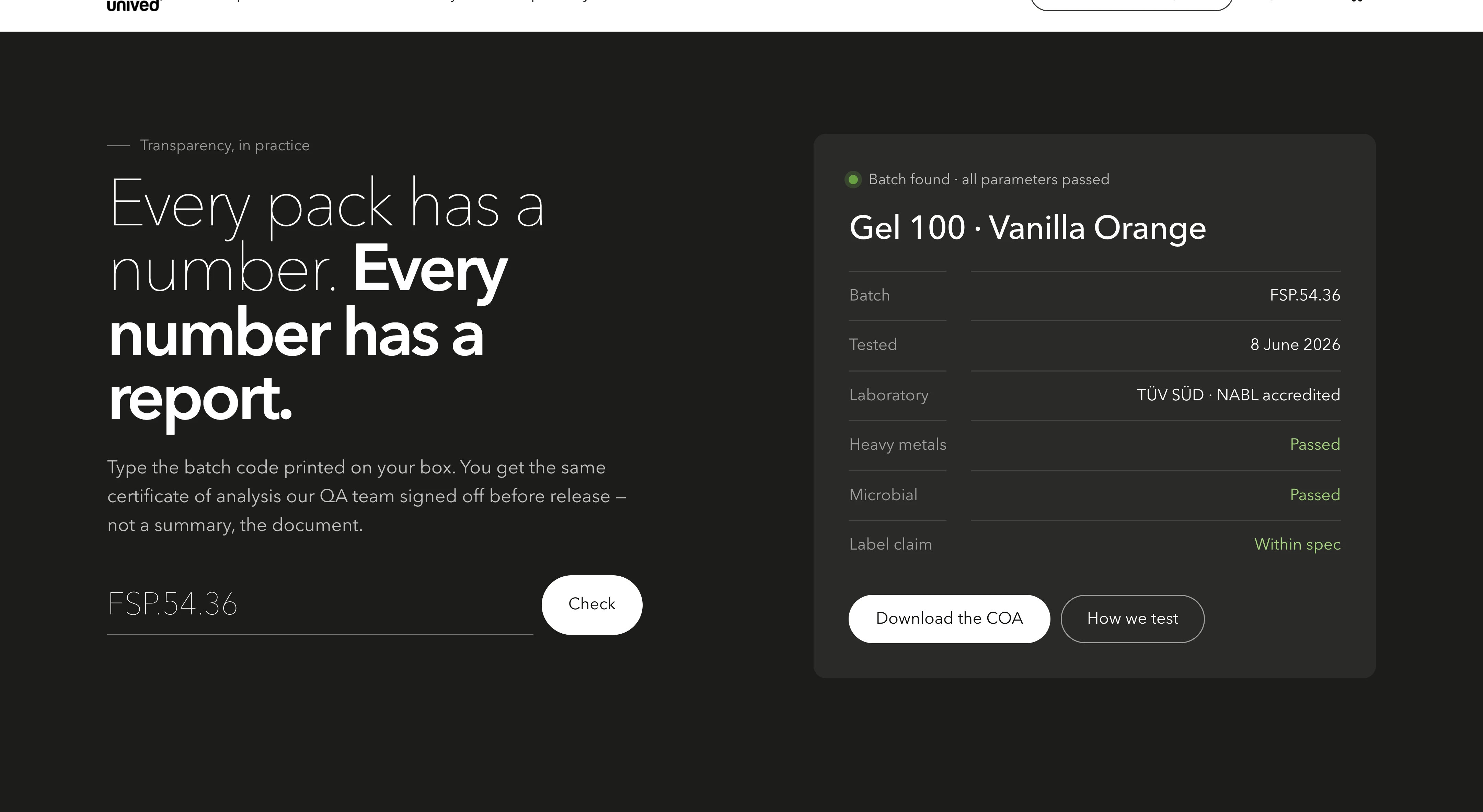
- Batch verification, on the page rather than buried
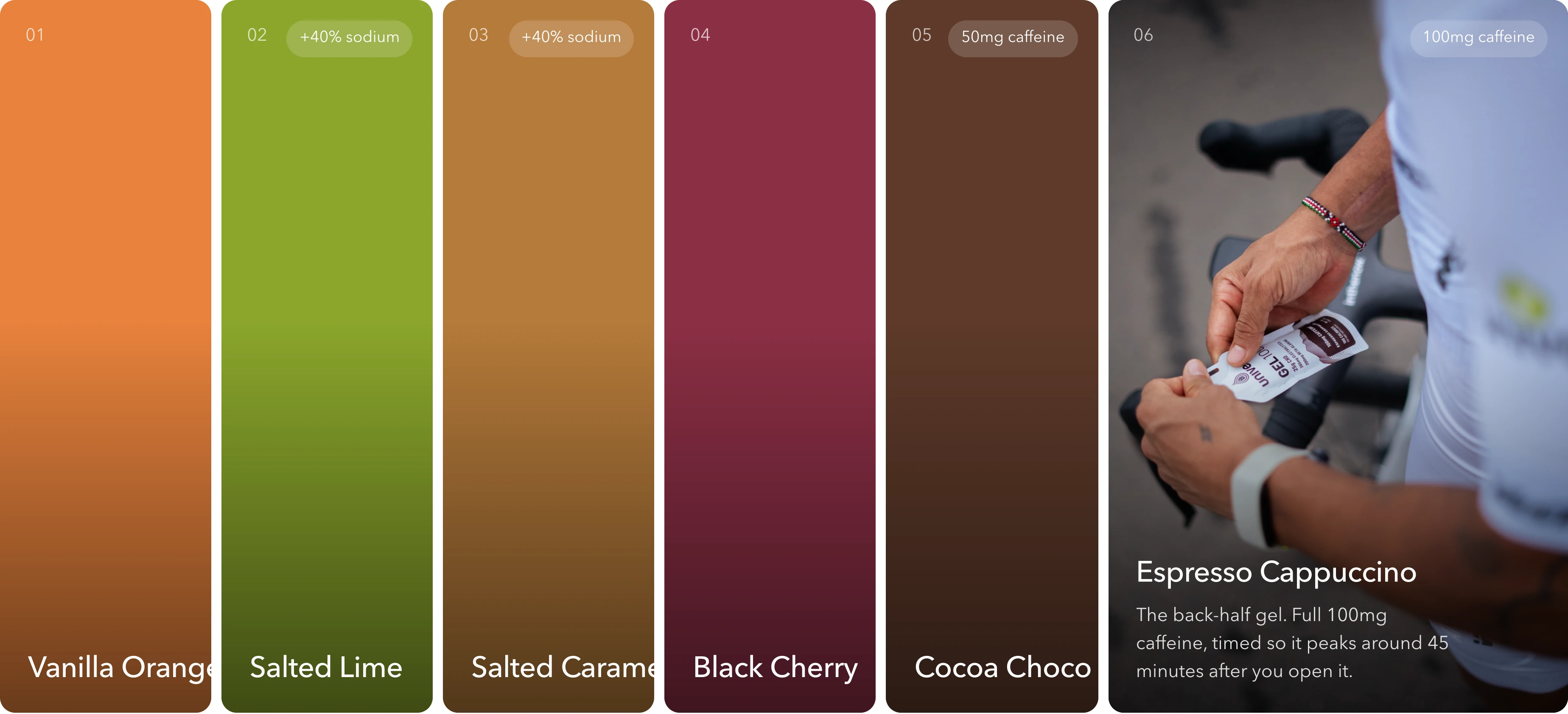
- Six flavours as one band of colour

Product page
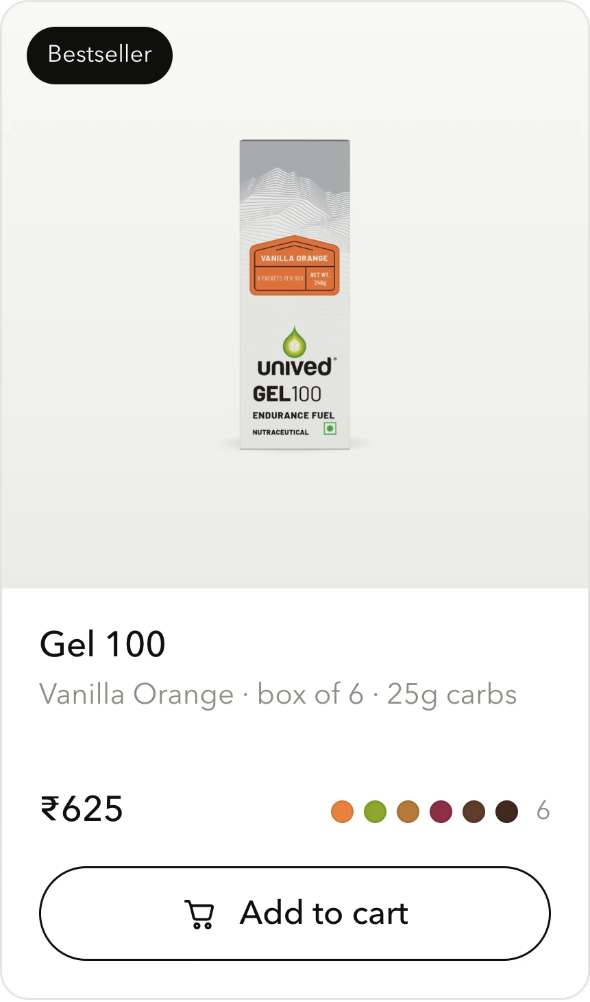
A gel is not bought like a flavour. It is bought like a dose, so the page leads with what it does and when to take it.
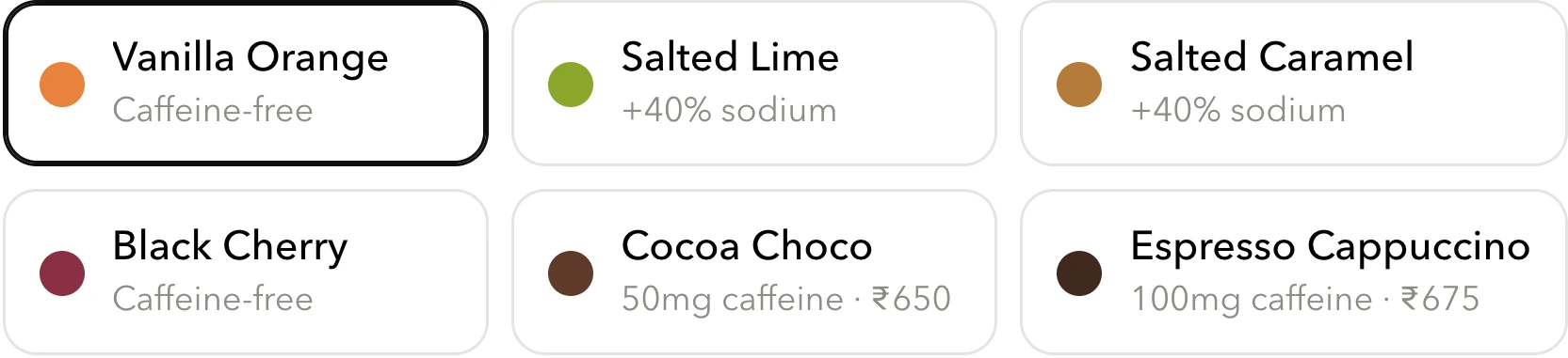
- Six flavours, each carrying its own caffeine and sodium
- Every dose printed out, not summarised
- What changes and when, hour by hour
- This box has a number, and the report behind it

Our story
One founder, no investors, and a business that started in 2010 because of a dream rather than a gap in the market.
- Year by year, in the founder's own words
- The question every formulation has to answer
- Three numbers instead of three paragraphs
Read at the start line, not at a desk.
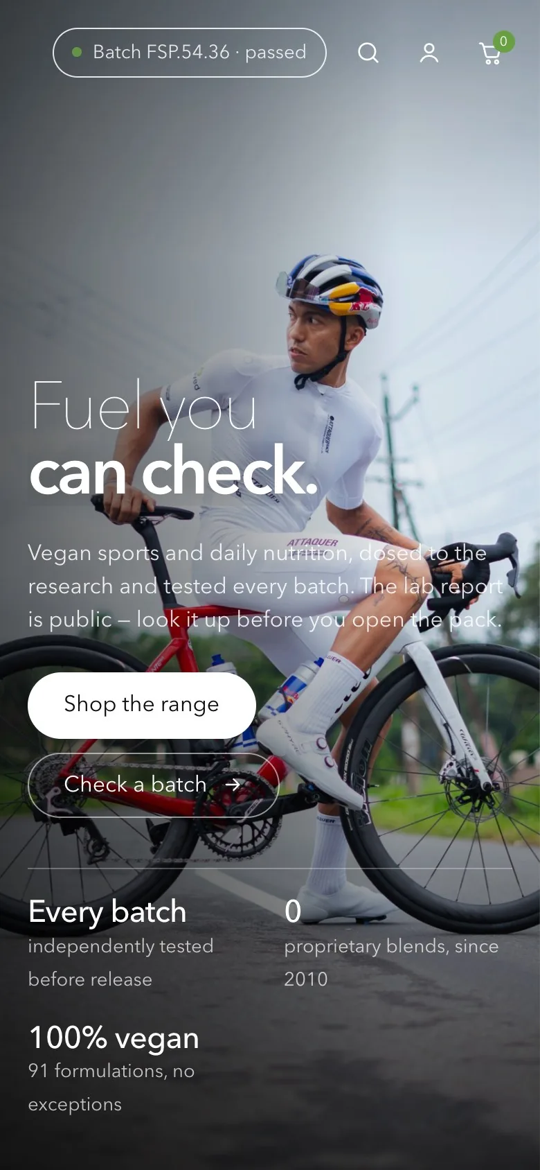
Dose timings and batch checks are things people look up mid-training, so the phone layout carries the same detail rather than a trimmed version of it.
One typeface, and nothing to hide behind.
No display face, no second family, no decorative anything. A single grotesque carries the whole store, and weight does the work that a second typeface usually does.
Vegan sports and daily nutrition, dosed to the research and tested every batch. The lab report is public: look it up before you open the pack.
The pieces the language is built from.
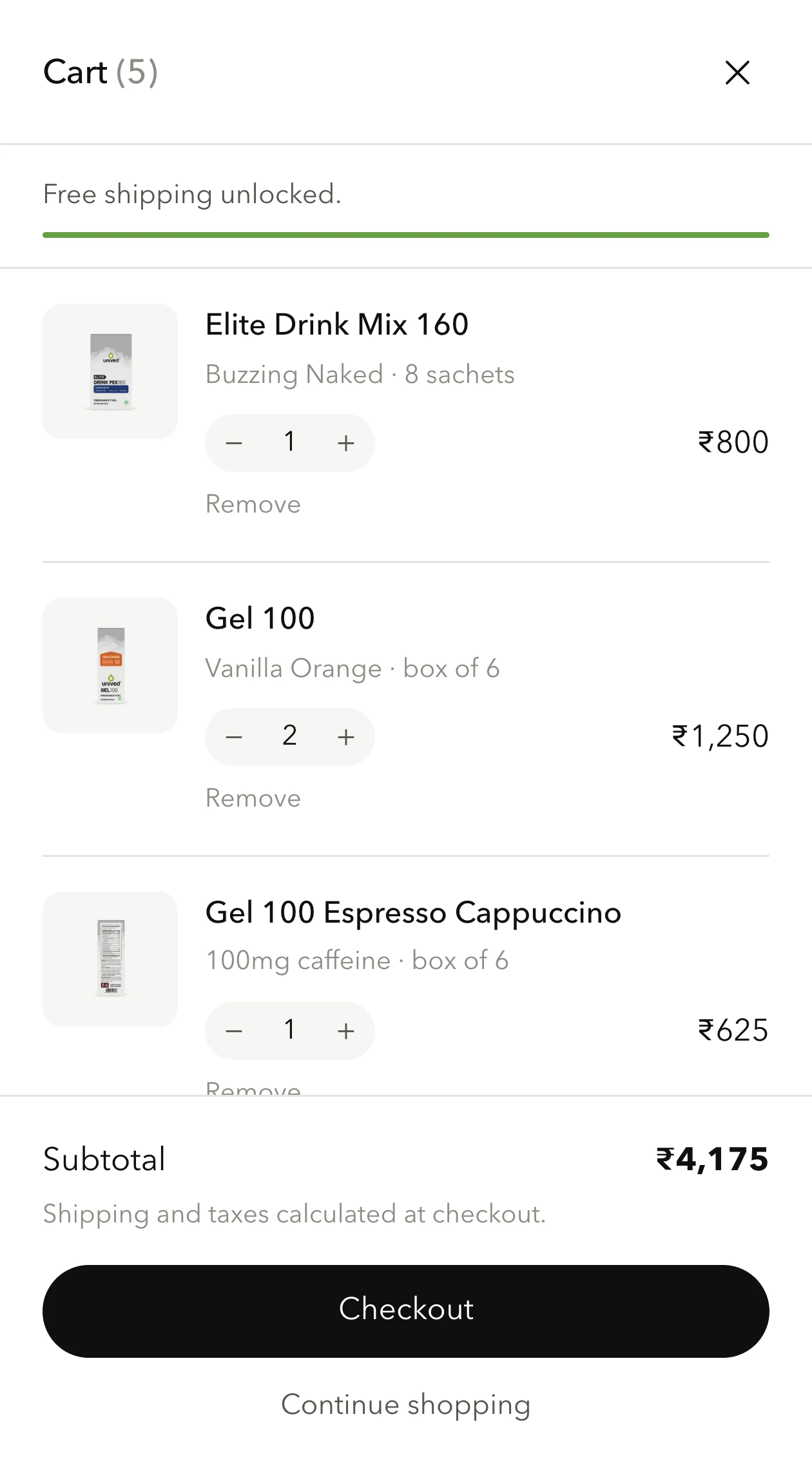
Every component below is a screenshot of the build, not a mockup. One typeface, one set of hairline rules, whether it is a button or the whole batch lookup.





The work, at a glance.
- Four homepage concepts to one direction
- Colour and type system
- Batch verification pattern
- Race-day protocol layout
- Product template
- Flavour accordion
- Dose and label tables
- Brand story page
- Cart drawer
- Mobile templates
Is your store as good as what you sell?
Tell us about your brand and your current store. We'll show you what we'd change first.
Schedule a Strategy Call