Work / Furniselan
Furniselan Solid wood, sold the way it is actually made.
A family-owned furniture maker that seasons its own timber and sells through its own showrooms as well as online. We redesigned the storefront so the material leads, and the questions furniture buyers really ask get answered on the way down the page.
- Client
- Furniselan
- Industry
- Solid wood furniture
- Making since
- 2015
- Scope
- Storefront redesign
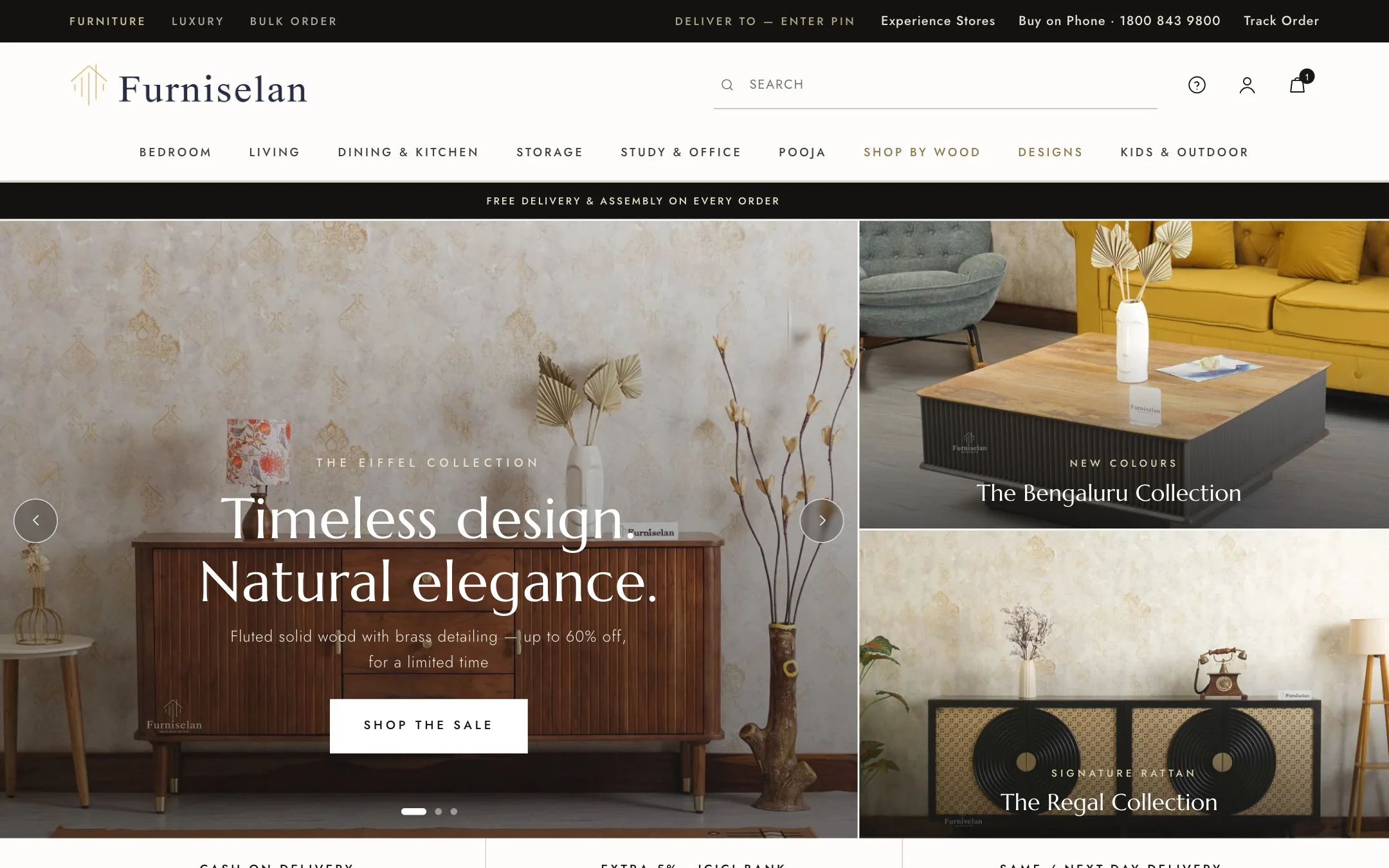
Furniture is a considered buy. The store had to answer, not shout.
Furniselan has been making solid wood furniture since 2015, seasoning its own timber and selling through its own showrooms alongside the website. Nothing in the range is MDF or particle board.
The old storefront led with discount tiles, which is how most furniture sites in the category look. The redesign had two jobs. Let the material carry the page, with room to see grain, joinery and finish. And answer the questions that decide a furniture order: will it reach me, who assembles it, what wood is it, and how long will it last.
"100% solid hardwood. No MDF, no particle board, ever." From the redesigned homepage
Same catalogue, a calmer shop floor.
The store as it is today, and the redesign, captured at the same screen size. Drag the handle to compare.
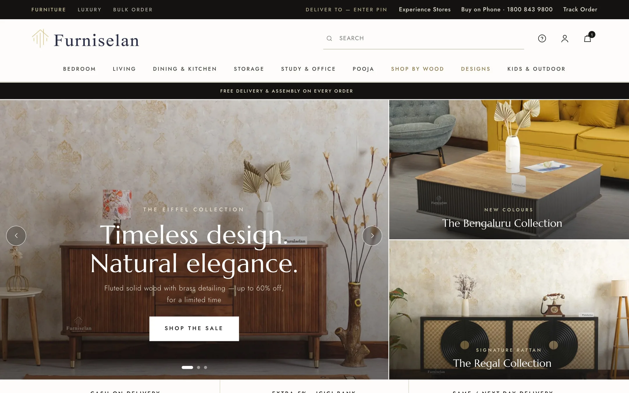
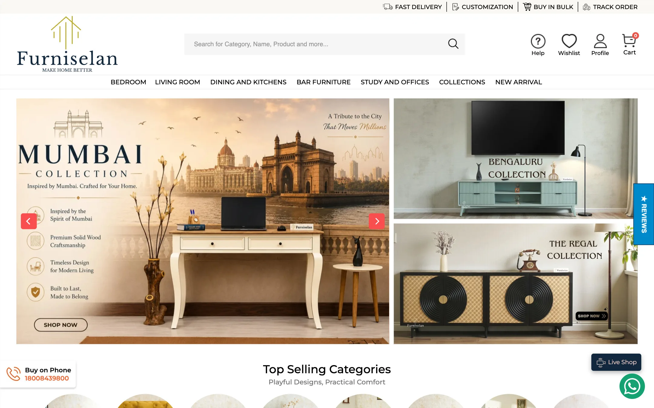
Homepage, top of the page.
Three templates, one material story.
Scroll through each page from top to bottom, or open it full size.

Homepage
Opens on a styled room rather than a sale banner, then works through the things a furniture buyer needs before they can commit.
- Find it by what it is, rather than by department
- A delivery check before you go further
- Real customer rooms, as short films
- A wood guide: sheesham, mango, acacia, teak
- The workshop story, and how a piece is made

Collection
People shop beds by size and by whether they need storage, so those are the filters, right under the title.
- King, queen, single, with storage, poster
- Sort by price or by biggest saving
- Complete the bedroom, after the grid
- A buying guide answering size and wood questions

Product page
Everything that usually sits in a support email is on the page: finish, dimensions, delivery, assembly and warranty.
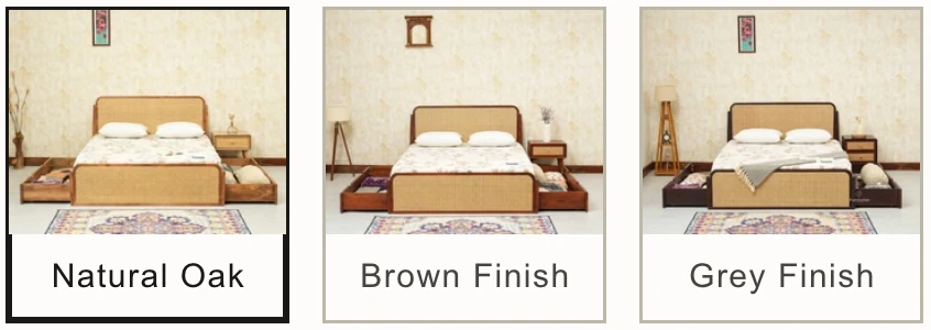
- Finish chosen by swatch, not by dropdown
- A delivery check before you commit
- Dimensions, care and warranty in tabs
- The same bed photographed in customers' rooms
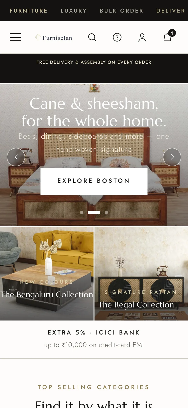
Built phone first, where most of this is bought.
Same order of information, rebuilt for one hand.
Navy and brass, with room to breathe.
A high-contrast serif for the headlines, a geometric sans for everything that has to be read quickly, and an ivory ground that lets timber tones do the talking.
Family-owned makers of solid wood furniture since 2015. Every piece built from seasoned hardwood in the brand's own workshop.
The pieces the language is built from.
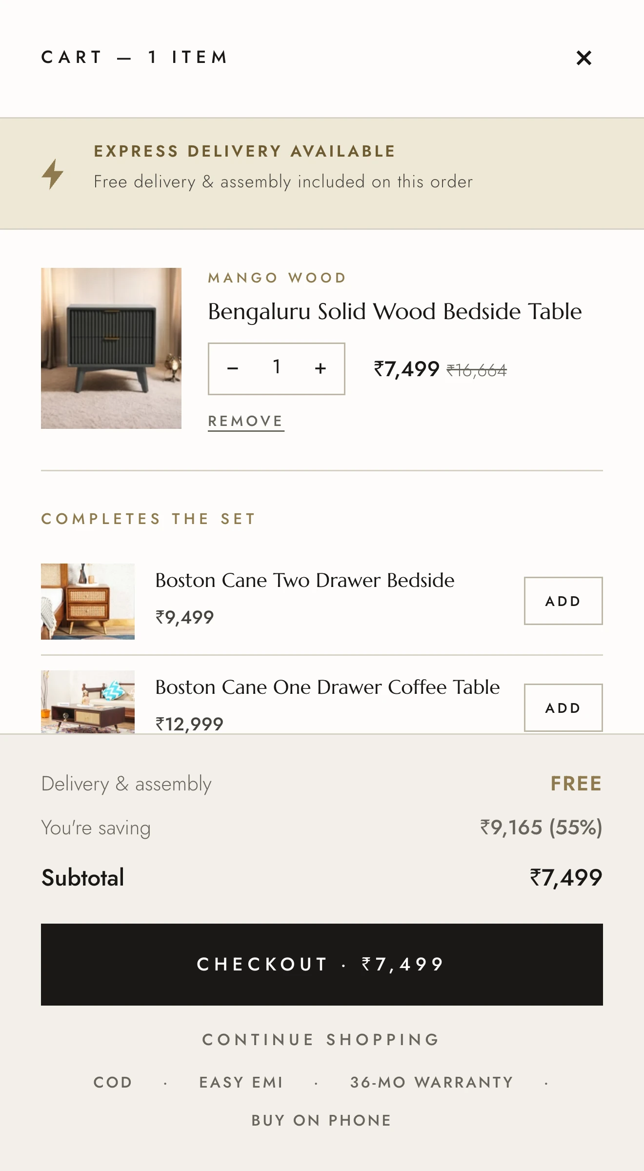
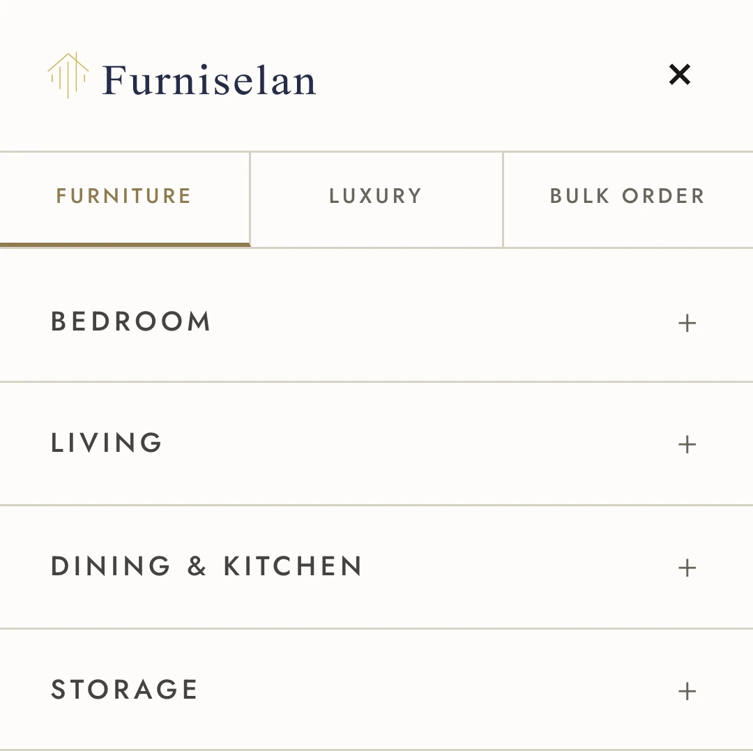
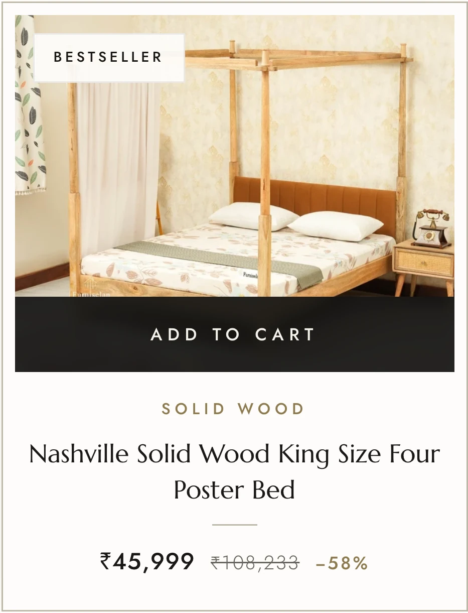
Every component below is a screenshot of the live build, not a mockup. Same type scale, same square corners, same one-pixel rules, whether it is a button or an entire cart.







The work, at a glance.
- Homepage, collection and product templates
- Category finder
- Delivery check
- Signature collections
- Wood and material guide
- Shoppable customer reels
- Showroom and Live Shop entry points
- Buying guides on collection pages
- Finish swatches
- Mobile templates
Is your store as good as what you make?
Tell us about your brand and your current store. We'll show you what we'd change first.
Schedule a Strategy Call