Work / Embelliv
Embelliv A sneaker that earns a second look.
Hand-embellished sneakers, embroidered by hand and released in limited runs. We built the store Embelliv launched on. This is the next version of it, which stops merchandising the shoes like inventory and starts photographing them like jewellery.
- Client
- Embelliv
- Industry
- Luxury footwear
- Based in
- Chicago, Illinois
- Scope
- Storefront redesign
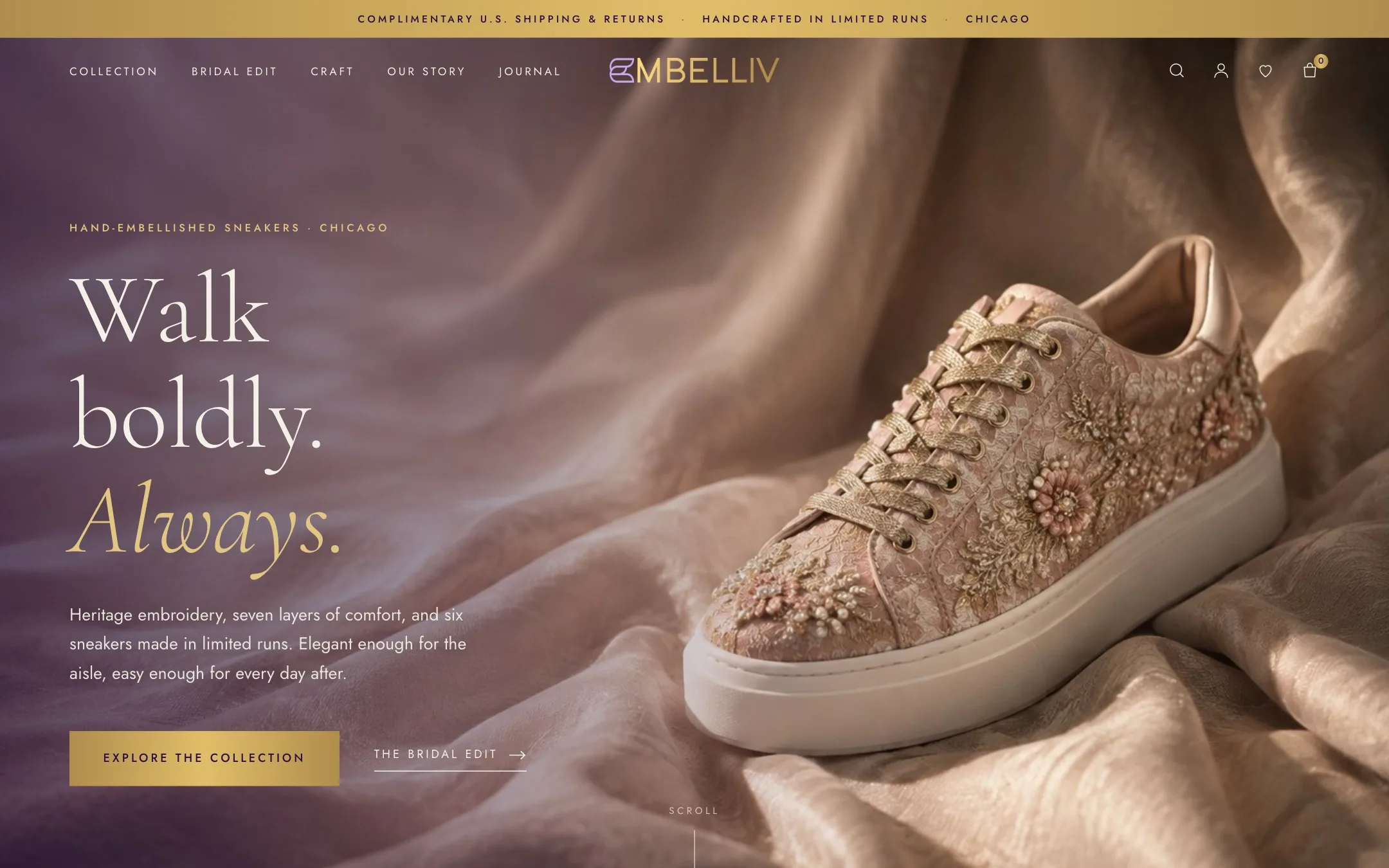
The shoes were the luxury. The store was not.
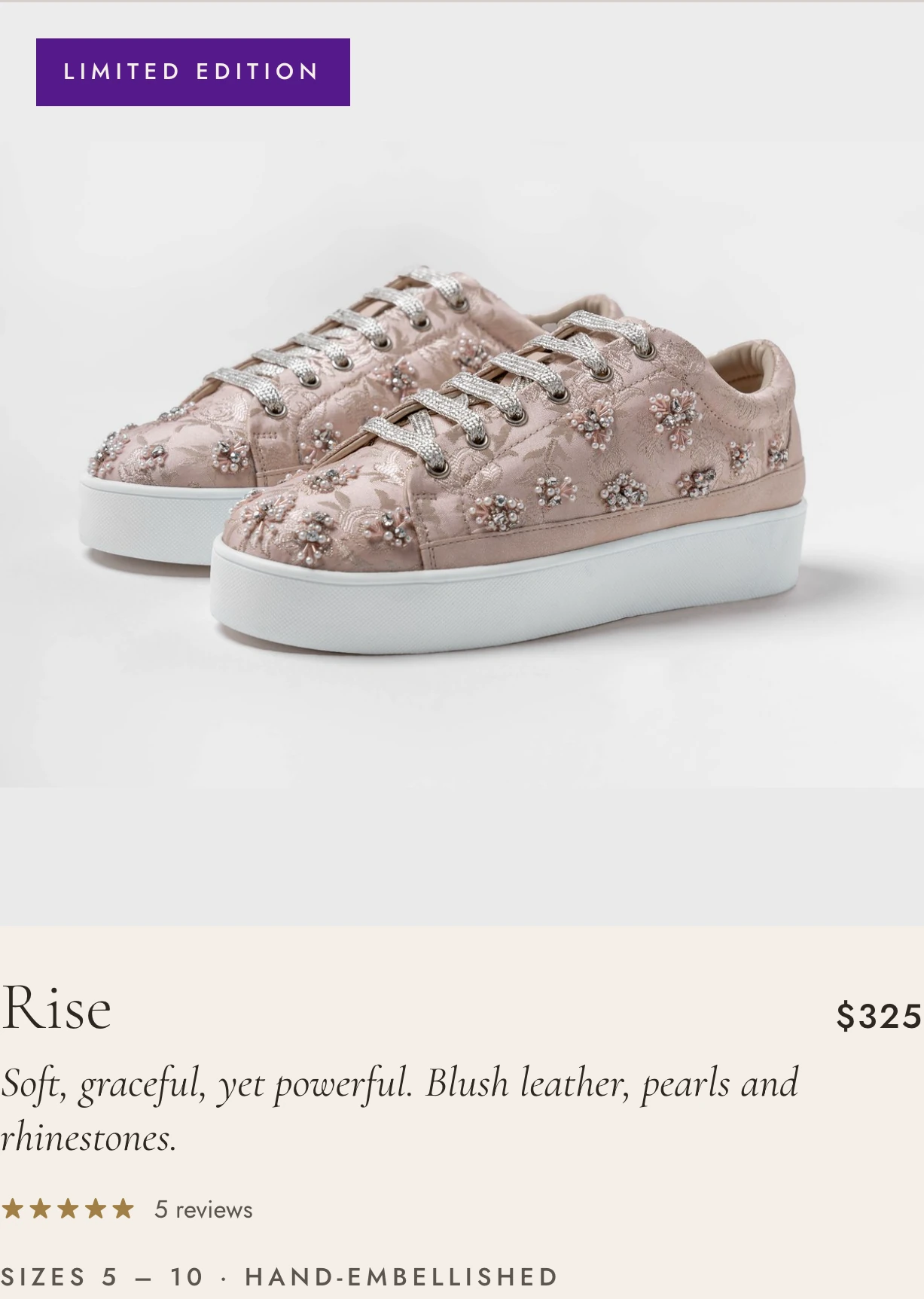
Every pair is embroidered by hand, in runs small enough that no two come out identical. That is the entire proposition, and a standard grid of product tiles throws it away: at thumbnail size, hand-set pearls look like print.
So the redesign had one job, approached two ways. Shoot the product the way the product deserves, close enough to see the metal thread and the stitch. And slow the page down, so a shopper meets the craft, the comfort and the size guidance before meeting the price.
Where this stands. The store shown as "before" is the one we designed and launched for Embelliv, and it is still live today. The redesign is captured from the build files and has not replaced it yet.
"Walk boldly. Always." Embelliv brand line
The launch store, and the next one.
The store running today, and the redesign, captured at the same screen size. Drag the handle to compare.
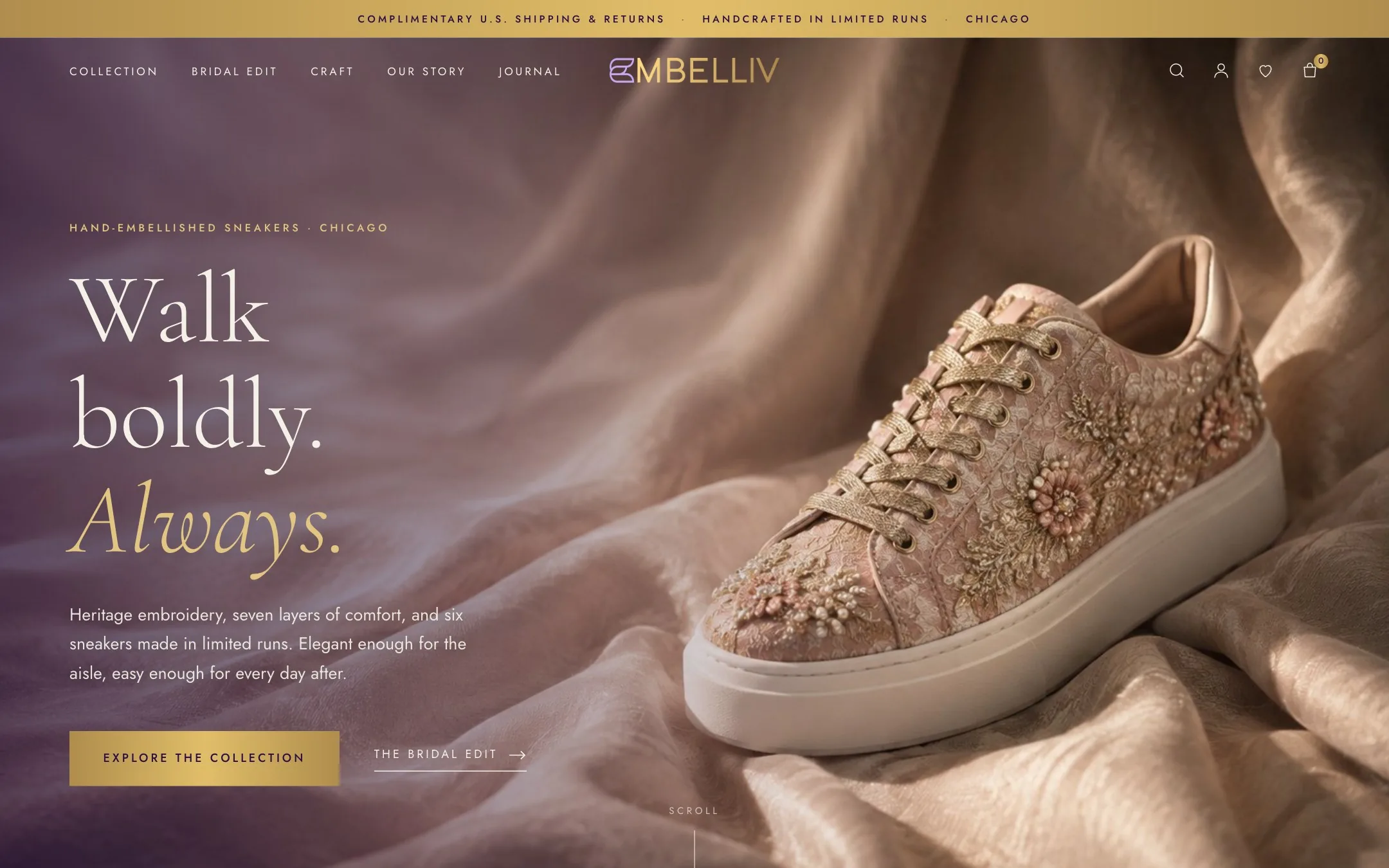
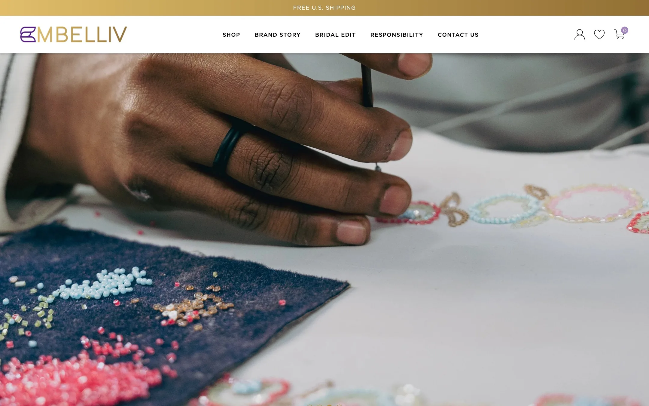
Homepage, top of the page.
Four templates, one long look.
Scroll through each page from top to bottom, or open it full size.

Homepage
Opens on one shoe, shot on draped silk at a distance where the embroidery is legible.
- All six styles in the first scroll, no carousel
- The embroidery shown at thread scale
- Occasions from the everyday to the aisle
- The three founders, near the end rather than the top

Collection
Six styles is not a catalogue problem, so the grid gives each pair room instead of packing the screen.
- Three up, at a size where the beadwork survives
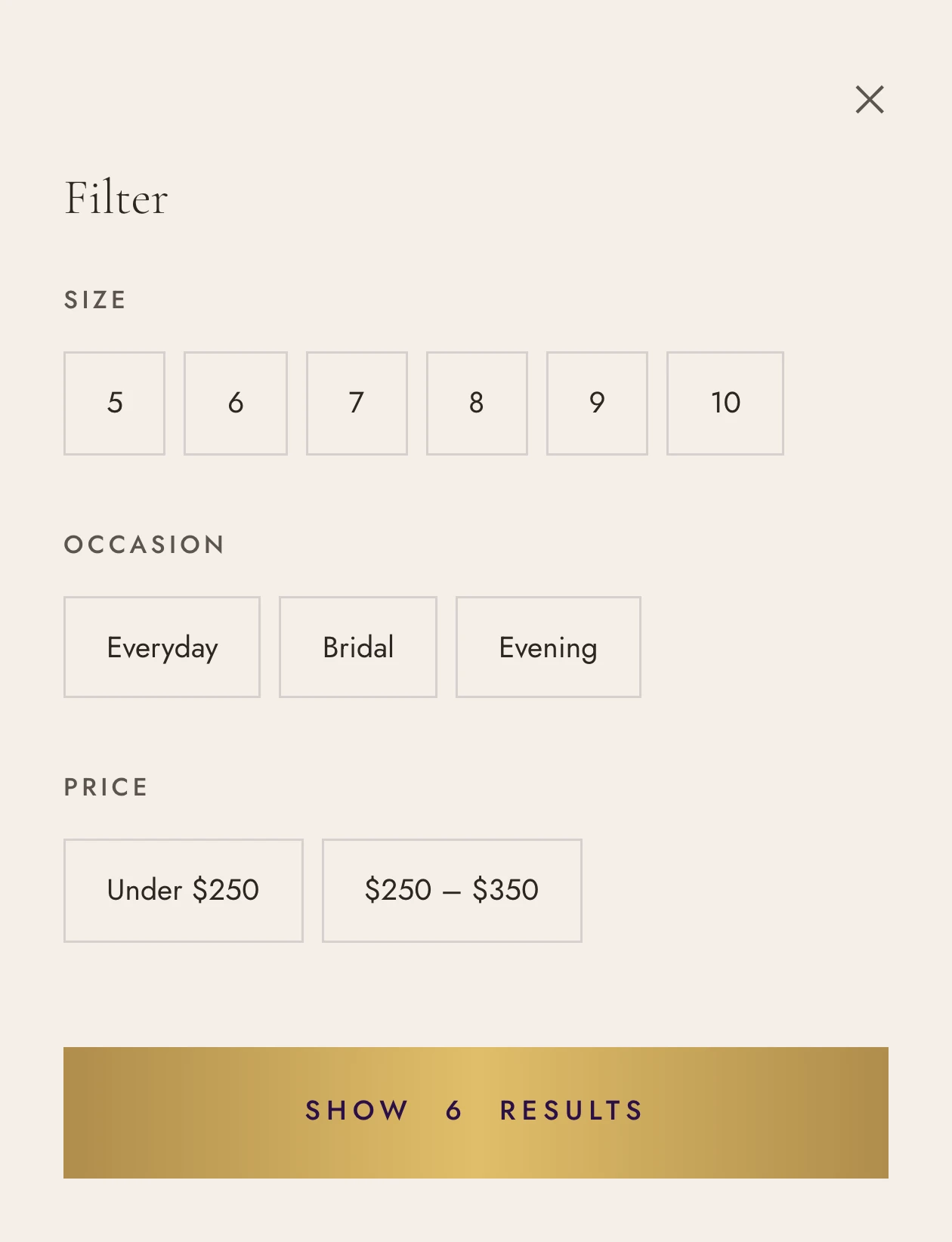
- Filter by size, occasion or price
- Rating and review count on every card
- Quick add without leaving the grid

Product page
A $325 sneaker has to answer more questions than a $95 one, and answer them before the button.
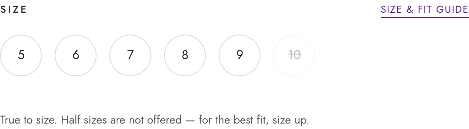
- Sizes 5 to 10, with sold-out states shown not hidden
- Fit stated plainly: true to size, no half sizes
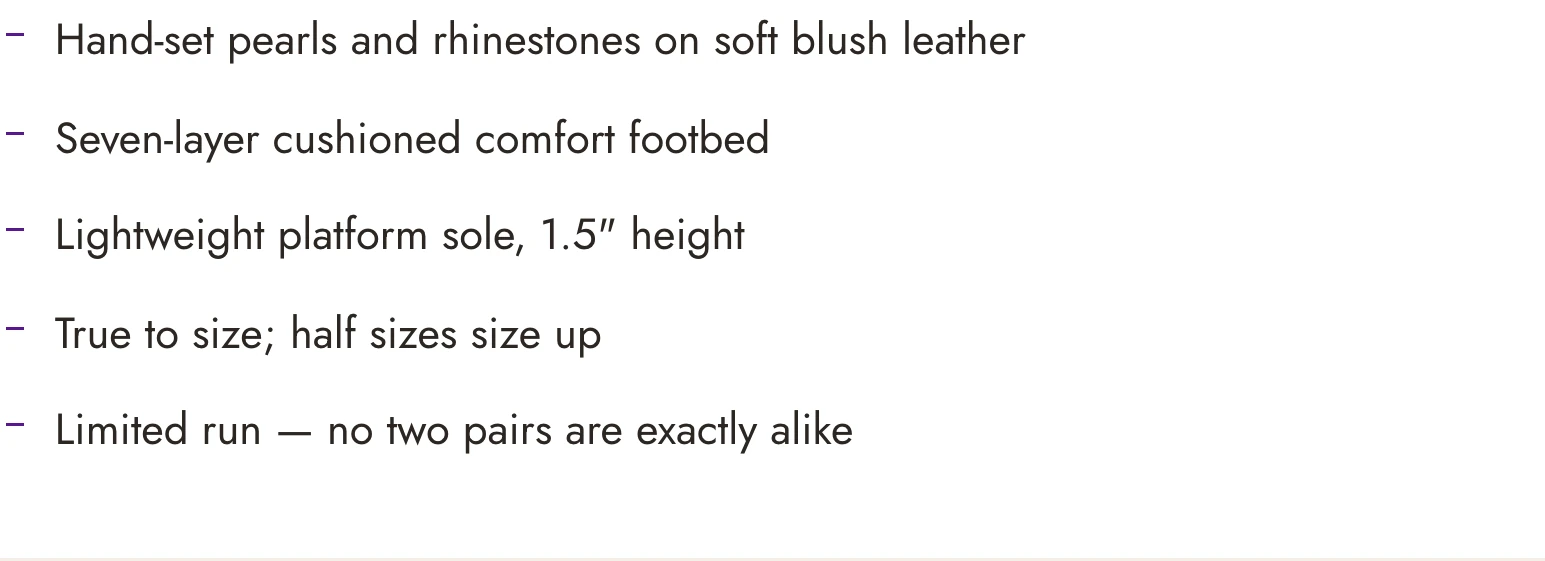
- Materials, comfort and care in short panels
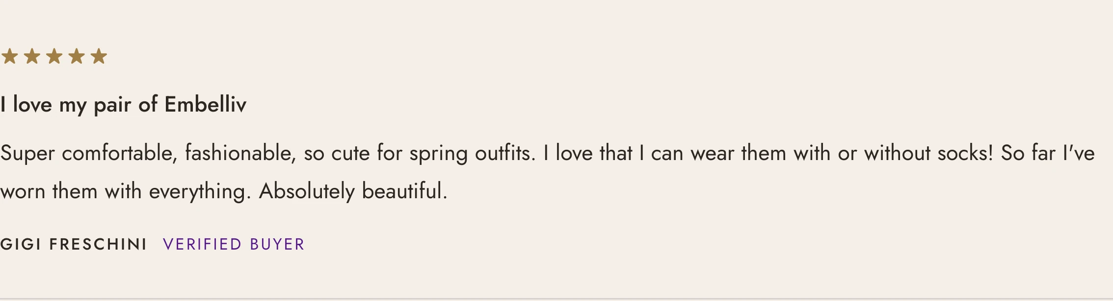
- Verified reviews with the whole rating, not the average

Our story
Three founders, one belief, and the part of the process that justifies the price.
- From thread to sneaker, step by step
- The seven-layer footbed, explained
- Heritage embroidery, without the museum tone
Close enough to see the stitch.
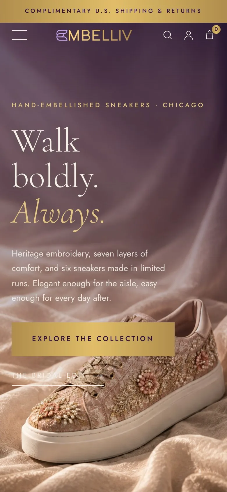
The detail that sells this shoe is a few millimetres wide, so the phone layout gives the photography the full width.
Aubergine, gold and a lot of quiet.
A light Garamond for everything that should feel written by hand, a geometric sans for everything that has to be read fast, and an ivory ground that keeps the embroidery the brightest thing on the page.
Hand-embellished sneakers made in limited runs in Chicago. Heritage embroidery, seven layers of comfort, and six styles built for the aisle and the everyday alike.
The pieces the language is built from.
Every component below is a screenshot of the build, not a mockup. One type scale, one set of hairline rules, whether it is a button or the whole filter drawer.






The work, at a glance.
- Art direction and image system
- Homepage
- Collection template
- Product template
- Filter drawer
- Size and fit guidance
- Review layouts
- Brand story page
- Bridal edit
- Mobile templates
Is your store as good as what you sell?
Tell us about your brand and your current store. We'll show you what we'd change first.
Schedule a Strategy Call