Work / Coral Haze
Coral Haze Hand embroidery, sold at scale.
Every pair is embroidered by hand, one at a time, by craftspeople who learned the technique from the generation before them. We built the Shopify store that turned that into a business serving 600,000 customers in 27 countries, and we have kept it running since.
- Client
- Coral Haze
- Industry
- Handcrafted footwear
- Reach
- 27 countries
- Scope
- Shopify store and retained support
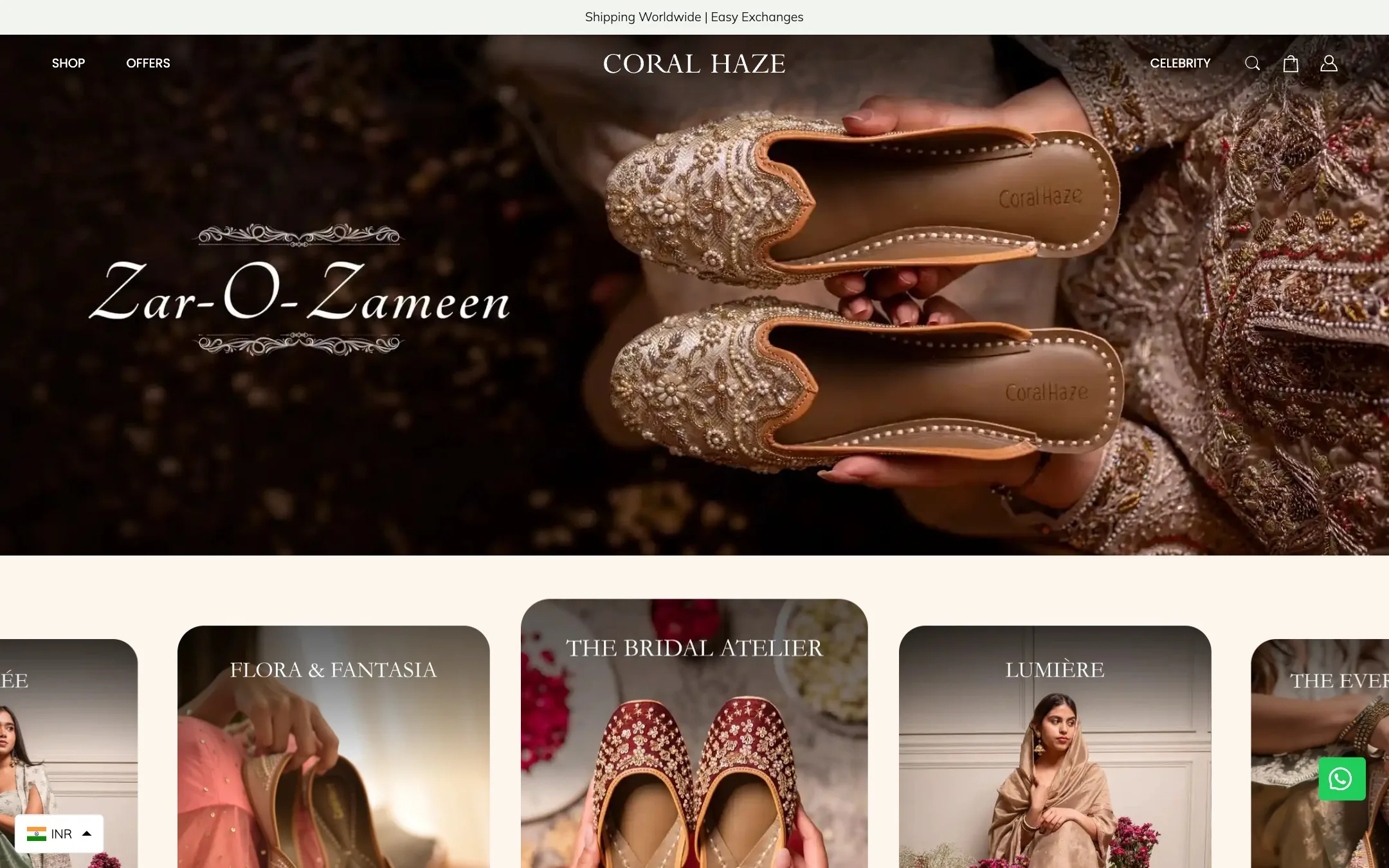
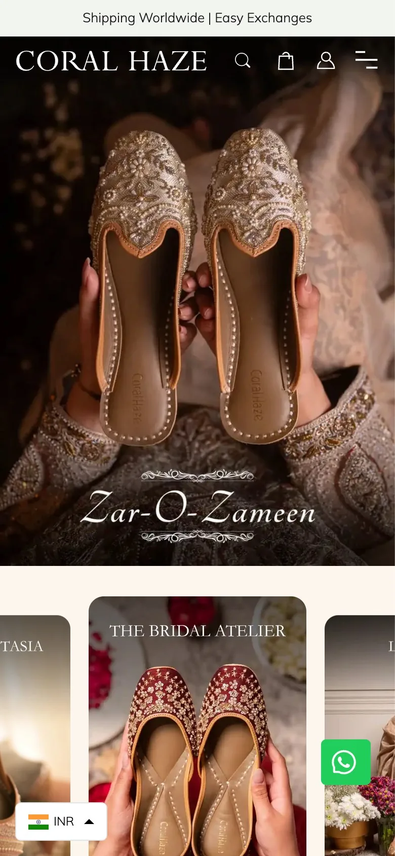
A craft business has one problem a catalogue cannot solve: proving it is handmade.
At thumbnail size, hand embroidery and machine embroidery look identical. The difference is in the density of the thread, the slight asymmetry between a left and a right, and the hours a person spent on it. None of that survives a product grid.
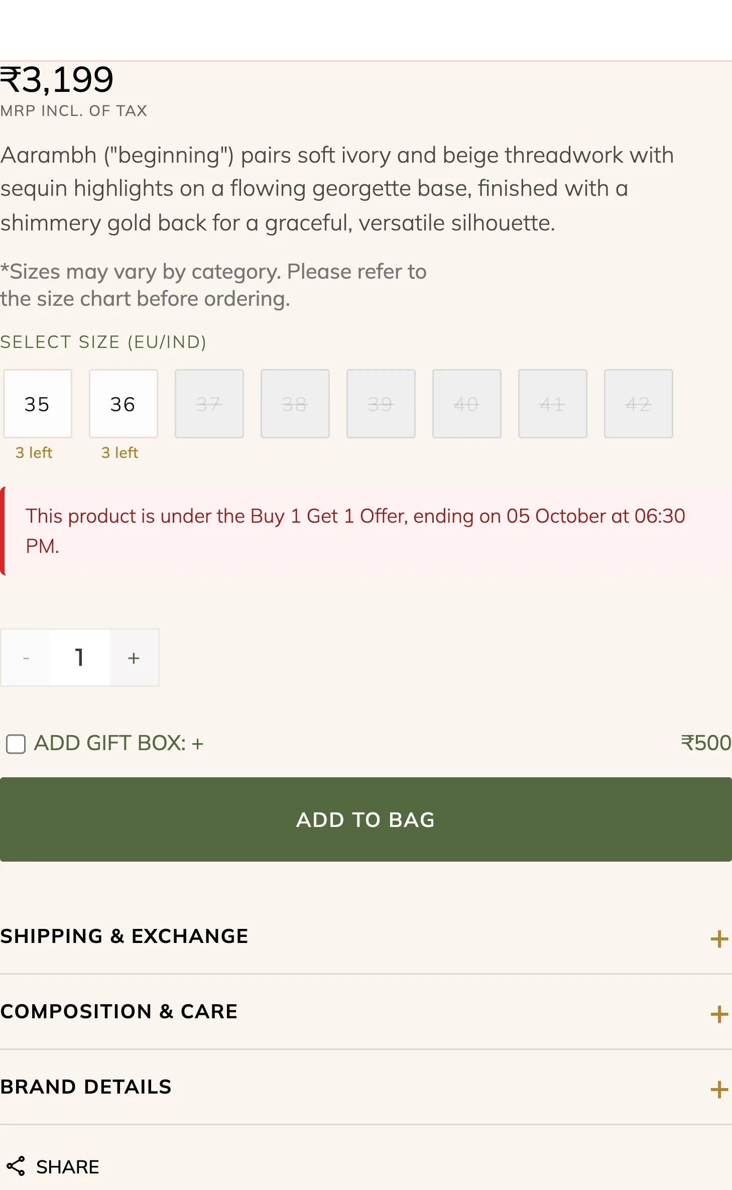
So the store does two things a standard theme does not. It gives the craft its own rooms, with the workshop, the materials and the process treated as merchandising rather than as an About page. And it puts proof on the product page, with per-size stock counts that come from small runs and a size guide written for feet rather than for a chart.
"Each pair begins with a karigar's skilled hands that have spent lifetimes learning their craft." From the store's own About page
Five templates, one workshop.
Scroll through each page from top to bottom, or open it full size.

Homepage
Opens on the season rather than on a sale banner, then splits the range into edits a buyer can recognise.
- Five edits, from the bridal atelier to everyday
- Karigari, the craft story, given a full band
- Nine years, told in objects rather than numbers
- Gifting treated as its own entrance

Collection
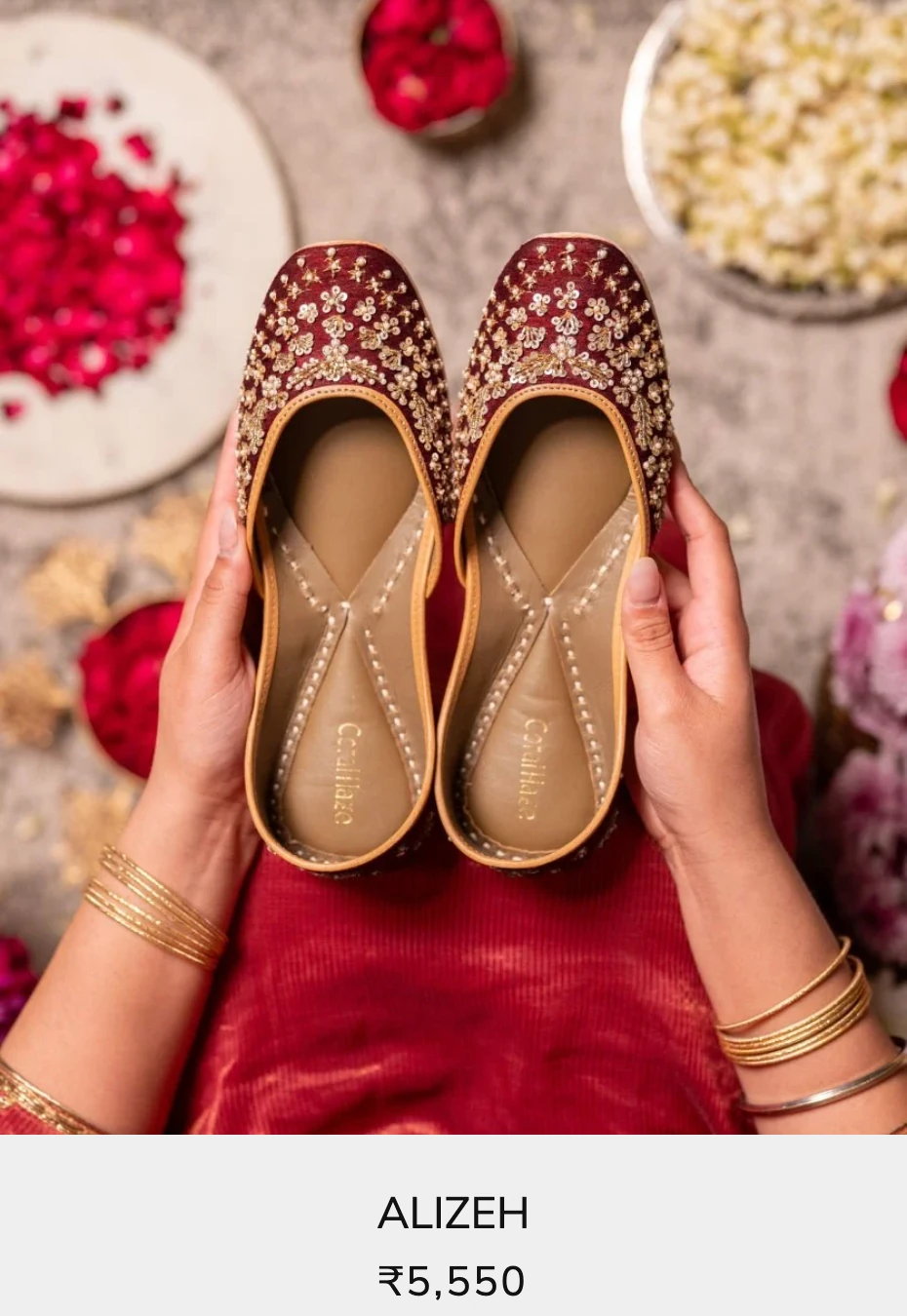
Four up, and every pair photographed on a person or in a room rather than floating on white.
- Each style named rather than coded
- Context shots, so the scale reads at a glance
- Sort and filter kept to one line
- A second image on hover, for the other angle
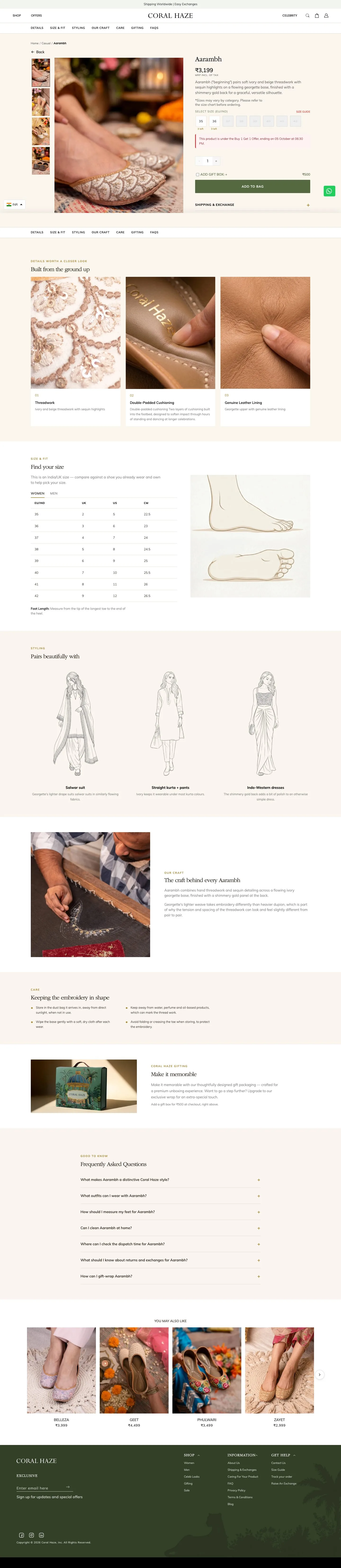
Product page
The page that has to carry the craft argument, because this is where the price gets justified.
- Per-size stock, counted down from a small run
- Three macro shots of thread, sole and lining
- A size guide measured in feet, not in codes
- What the embroidery is, and how to keep it

Spotted
Press coverage usually dies in a logo strip. Here every photograph is wired to the product in it.
- Fifty-odd placements in one scroll
- Each shot paired with the exact style
- Shop the pair without leaving the page
- Proof that reads as merchandising, not PR

About
Three founders, a considered approach to design, and the reason the pieces take as long as they do.
- The approach, stated before the product
- Hands at work, shot close
- 600,000 customers, 27 countries
The same rooms, one hand wide.
Browsing, the craft story and the press wall, all rebuilt for a phone.
A serif, an olive, and a lot of white.
The photography is dense, warm and busy by nature, so the interface around it does almost nothing: one serif for names, one sans for everything functional, and white between.
Hand embroidery, worked one pair at a time by craftspeople who learned the technique from the generation before them. No two pairs are identical, and they are not meant to be.
The pieces the store is built from.
Every component below is a screenshot of the live store, not a mockup. One serif, one sans, hairline rules, and a single olive that only ever means "do this".





The work, at a glance.
- Shopify store design and build
- Collection and edit structure
- Product template
- Per-size stock display
- Size guide
- Shoppable press gallery
- Gifting and gift box add-on
- Craft and brand story pages
- Worldwide shipping and exchanges
- Ongoing maintenance retainer
Is your store as good as what you sell?
Tell us about your brand and your current store. We'll show you what we'd change first.
Schedule a Strategy Call