Case Study · Shopify Store Redesign

A redesign worthy of
a luxury fashion
collection.

Timothy DeClue Collection is a luxury fashion brand a designer label with a distinct aesthetic and a collection that demands an online presence of equivalent quality. The existing Shopify store wasn't matching the brand's positioning. We redesigned it from the ground up a new visual language, rebuilt product pages, and a shopping experience that finally reflects the craftsmanship behind every piece.

Luxury
fashion
Shopify
redesign
Designer
label
Full
theme rebuild
Live Store Preview

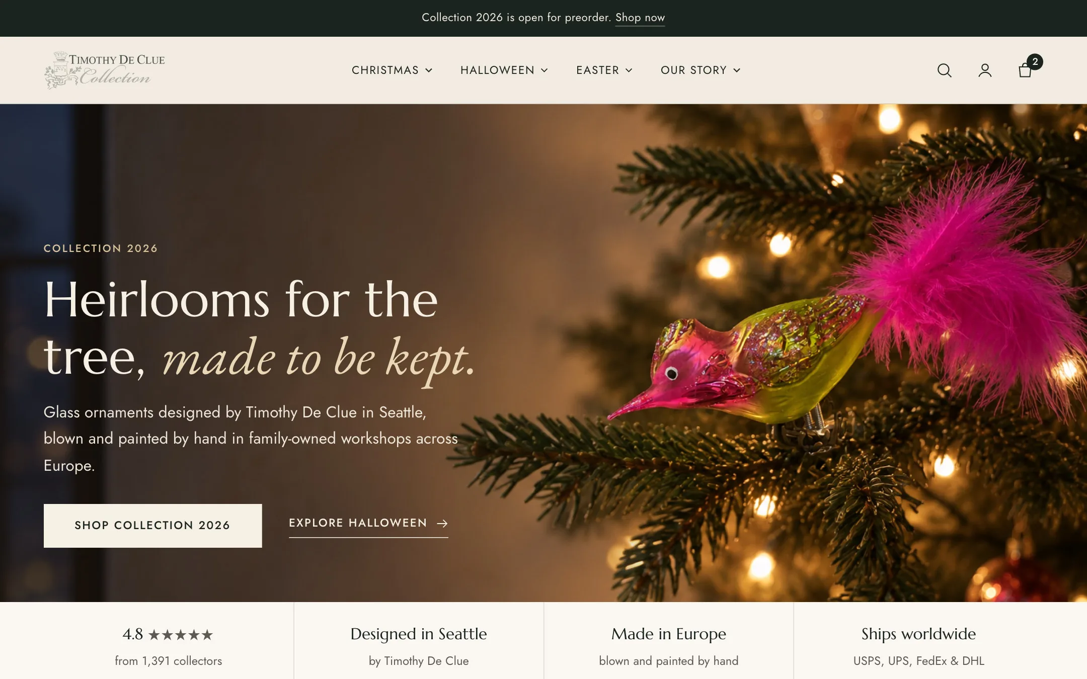
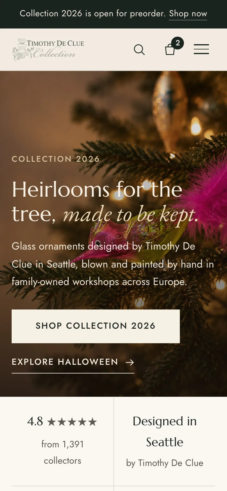
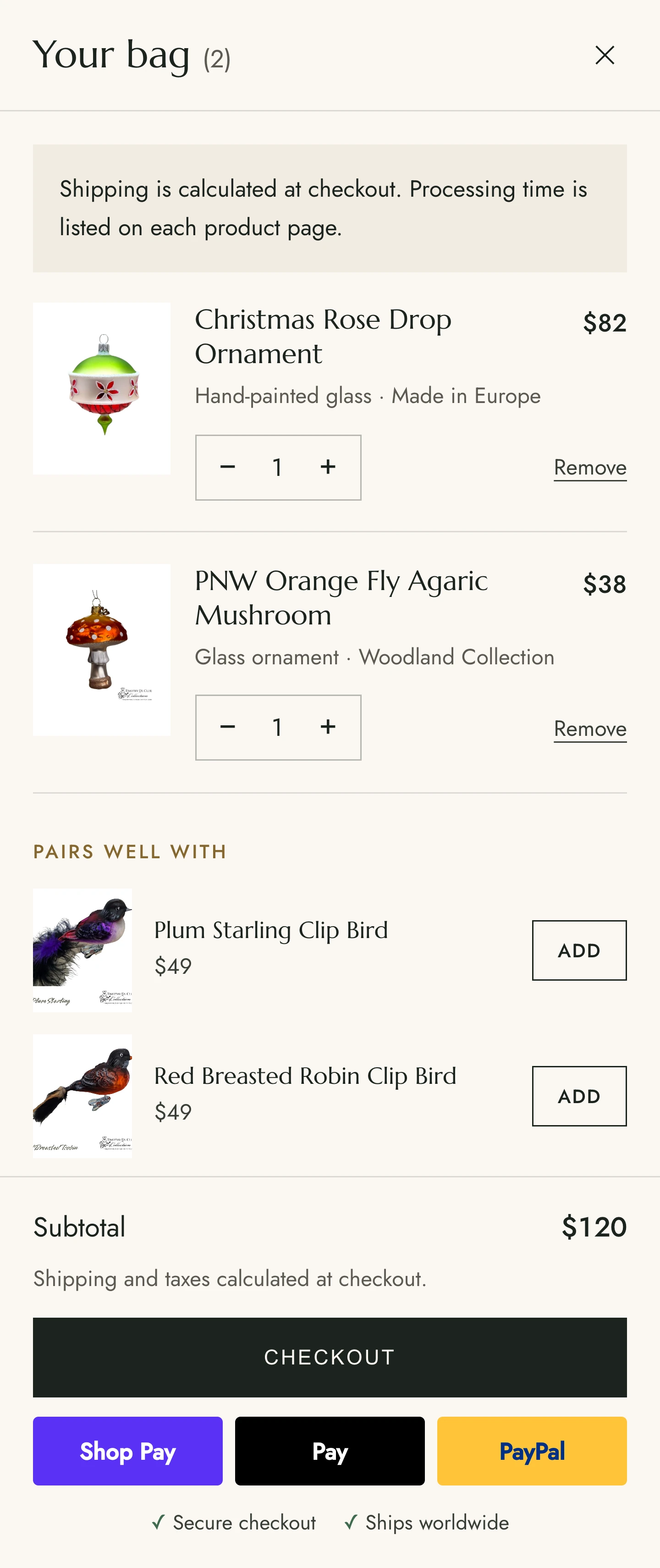
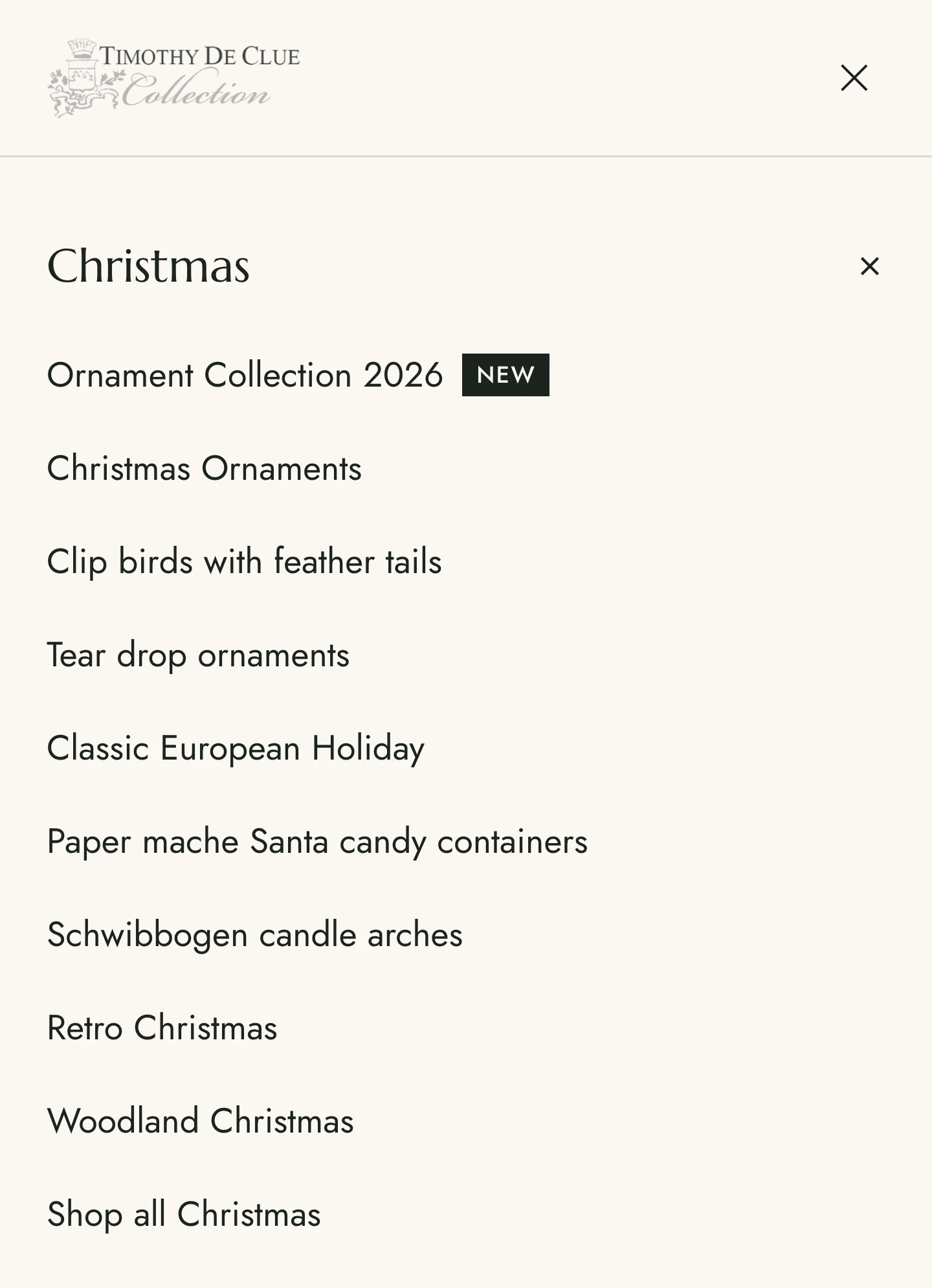
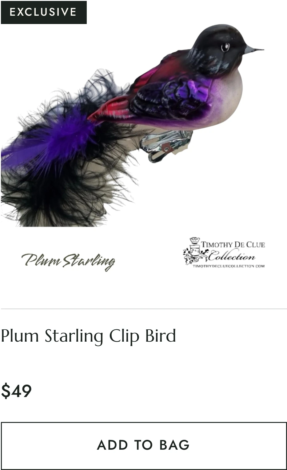
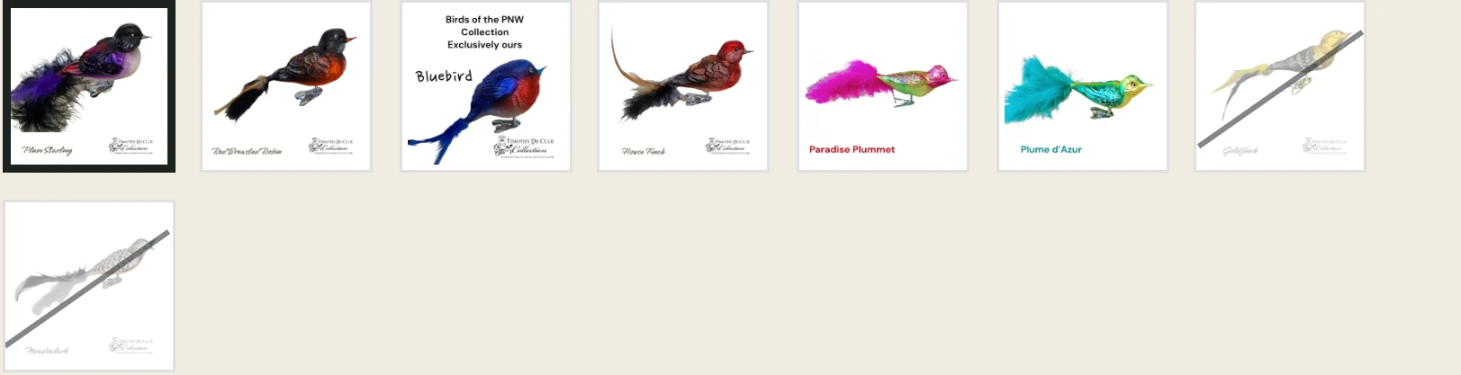
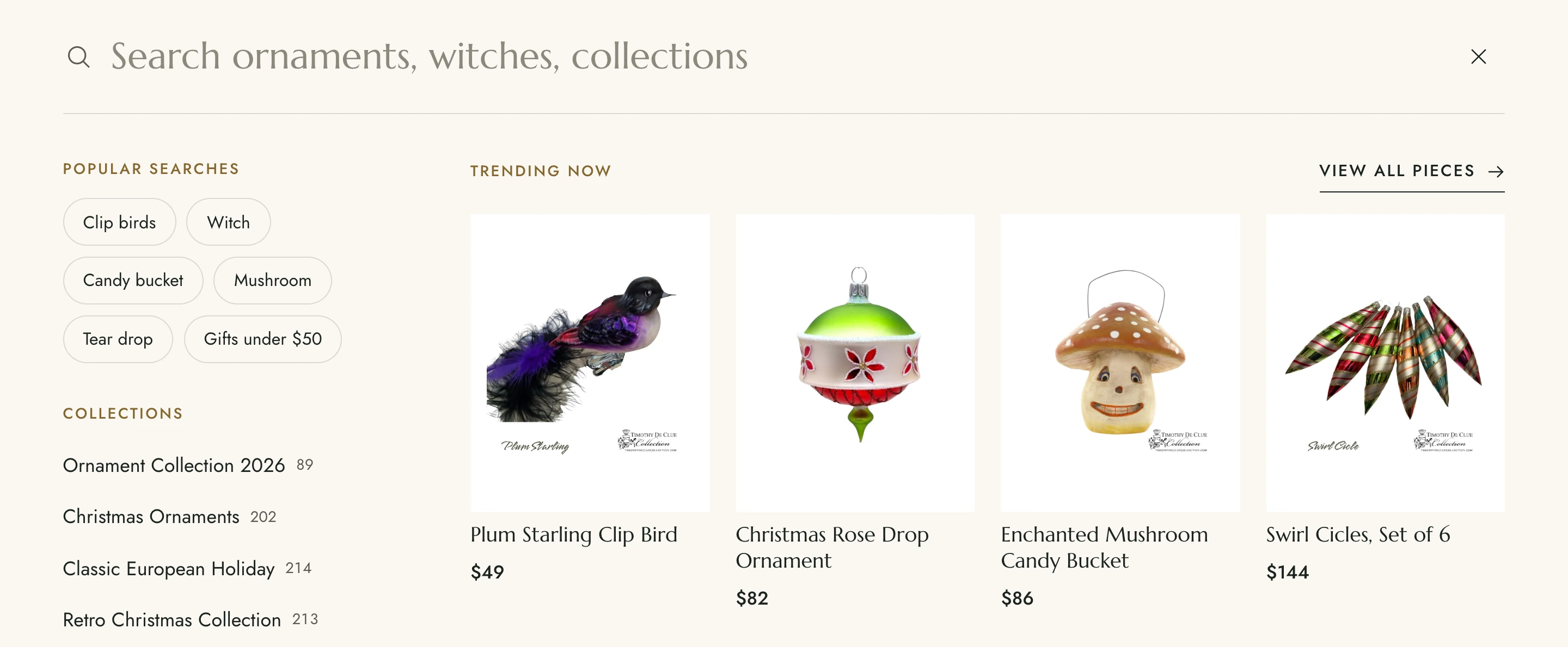
The finished store, live on Shopify

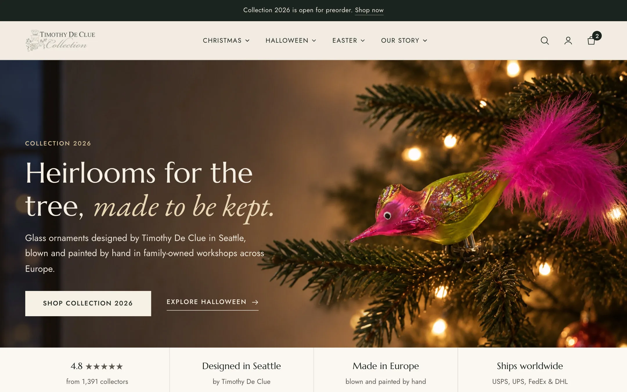
A dark, editorial, fashion-forward storefront built to present luxury designer products with the visual weight they deserve. Desktop and mobile views of the redesigned Timothy DeClue Collection store.

Visit timothydecluecollection.com
Timothy DeClue Collection desktop
Timothy DeClue Collection mobile

A designer label with a vision the store wasn't showing

Timothy DeClue Collection is a designer fashion label with a clear and distinctive creative vision clothing and accessories that occupy the space between streetwear-influenced contemporary fashion and considered luxury design. The brand had an established presence and a loyal following of customers who appreciated the quality and intentionality of the collection.

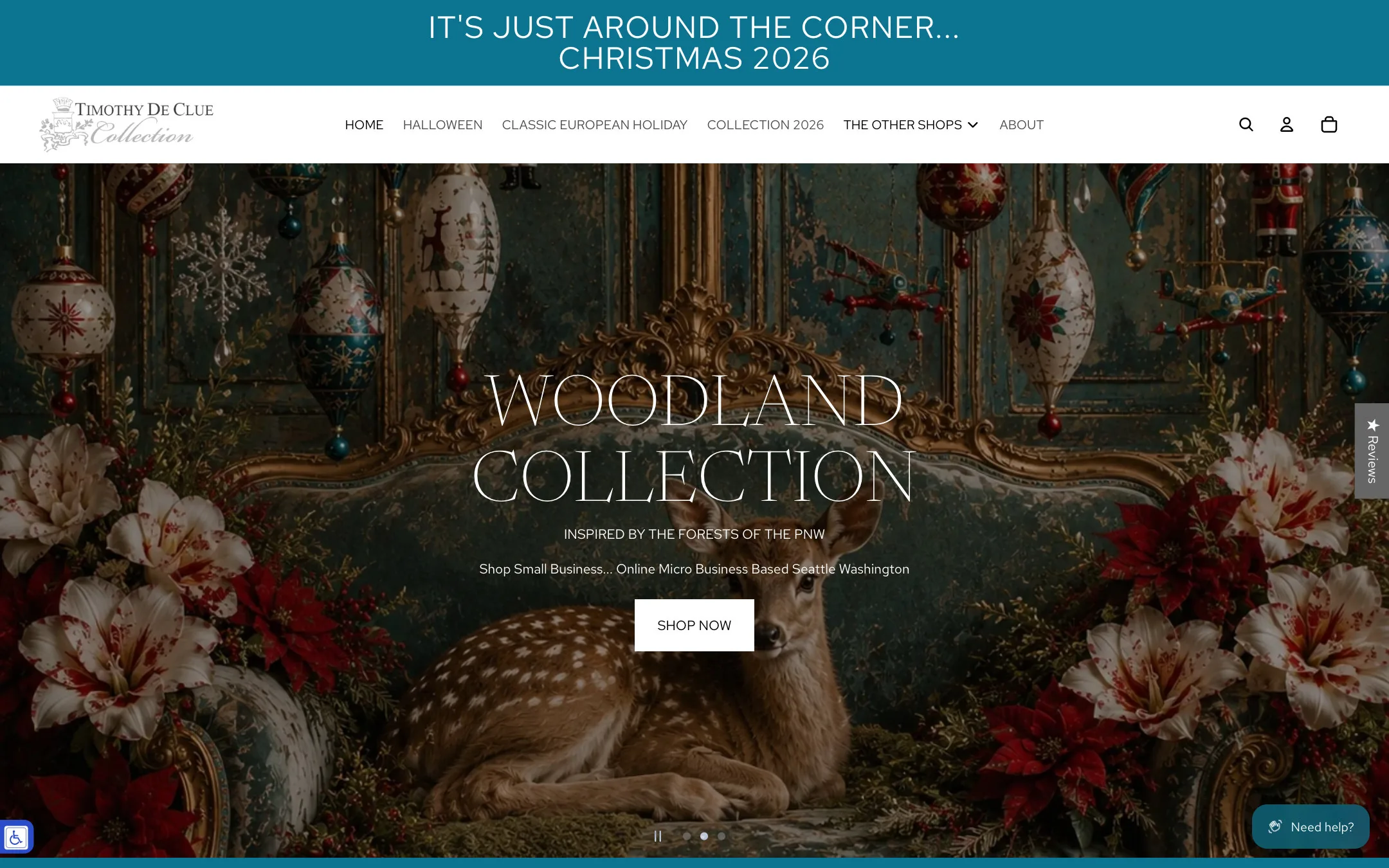
What it lacked was an online store that matched the level of craft going into the products. The Shopify store that existed was functional, but it wasn't doing justice to the brand. Visitors were arriving, seeing a generic-feeling storefront, and not converting at the rate a brand of this quality should expect.

The redesign brief was clear: build a store that made the brand's aesthetic impossible to miss from the first page load.

Timothy DeClue Collection screenshot Homepage - timothydecluecollection.com

Understanding the creative vision behind the collection

Before building anything, we needed to fully understand what Timothy DeClue Collection was and what the redesign needed to achieve. Four defining characteristics shaped every decision.

01
A distinctive creative vision that needed digital expression
Timothy DeClue Collection has a clear, recognisable aesthetic one that existing and potential customers recognised and responded to. The redesign needed to capture that aesthetic in every design decision, from typography and colour to layout and animation making the brand's visual identity unmistakable online.
02
High-quality product photography requiring the right stage
The collection is photographed with editorial quality. The existing store wasn't giving that photography the space and presentation it deserved cropping it awkwardly, displaying it at the wrong scale, or competing with design elements that should have been receding. The redesign needed to let the product photography lead.
03
Luxury fashion UX - a specific set of requirements
Luxury fashion customers browse with intention but purchase with consideration. They expect lookbook-style collection presentations, detailed product storytelling, clear sizing and fabric information, and a checkout experience that feels as refined as the brand. They do not respond to urgency tactics or cluttered layouts.
04
Mobile performance for a fashion-forward audience
A young, fashion-conscious audience browsing primarily on mobile expecting a fast, visually rich experience that transitions seamlessly from Instagram to store without a visible quality drop. The redesign needed to prioritise mobile performance and visual fidelity simultaneously.

A brand of this quality deserved a store that proved it

Timothy DeClue Collection had the product, the aesthetic, and the audience. The store was holding all three back. These were the four core problems we were brought in to solve.

Brand
The store wasn't reflecting the brand's positioning
A generic Shopify theme cannot communicate the specific aesthetic of a designer label. Visitors arriving from social media and editorial features expected a store that matched what they had seen and the gap between brand and storefront was costing conversions.
Photography
Product photography wasn't getting the treatment it deserved
High-quality editorial photography displayed in the wrong format, wrong dimensions, or competing with cluttered page elements loses its power entirely. The redesign needed to put the photography at the centre of every page decision.
UX
Collection navigation and product discovery
A growing designer collection needs a navigation system that can surface new arrivals, present seasonal collections editorially, and allow customers to browse by category, material, or occasion without losing the premium feel that fashion buyers expect.
Mobile
Social-to-store transition not converting
Significant Instagram and social media traffic arriving on mobile and not converting largely because the mobile store experience didn't match the quality of the social content that drove the click. Fixing this was the single highest-impact conversion opportunity.

Rebuilt from the ground up, designed for the brand

We started from a clear brief make Timothy DeClue Collection feel as premium as the products it sells, and build a store that turns every visitor into a believer. Every decision, from layout philosophy to photography presentation, was made with that goal in mind.

Phase 01
Store Audit & Brand Discovery
A detailed review of the existing Shopify store alongside an immersive brand discovery session studying the collection, the brand's aesthetic references, its photography direction, and the customer journey from social media discovery to purchase. The audit identified the specific gaps between brand perception and store reality.
Phase 02
Design Direction & Editorial Concept
A new visual direction for Timothy DeClue Collection: dark, editorial, fashion-forward. A typography system that reflected the brand's aesthetic. Layout principles that put photography at the centre and copy in support. Wireframes of homepage, collection page, product page, and lookbook template reviewed with the client before any code was written.
Phase 03
Shopify 2.0 Theme Rebuild
The full theme was rebuilt on Shopify 2.0 replacing the existing theme with a custom build that gave the brand complete creative control. New sections and blocks designed around the editorial fashion format: full-bleed imagery, cinematic homepage hero, lookbook-style collection presentations, and a product page that surfaces the story behind each piece alongside the commercial information.
Phase 04
Collection Architecture & Lookbook Templates
The collection navigation was redesigned around fashion seasons and categories with lookbook-format collection pages that presented the range editorially before driving into individual products. A new arrivals system, seasonal collection pages, and a streamlined product filtering architecture that maintained the premium feel throughout.
Phase 05
Photography Optimisation & Performance
All product and editorial photography run through an optimisation process: correct format (WebP where supported), responsive srcset for all device sizes, and lazy loading for below-fold images. The result was page load times that matched the visual quality rather than fighting against it.
Phase 06
QA, Launch & Post-Launch Support
Pre-launch QA across devices with particular emphasis on the Instagram-to-mobile-homepage journey that was the most commercially important path. Launch managed with post-launch monitoring. Post-launch support covered image optimisation for new product additions and seasonal collection launches.

Four outcomes that made the biggest difference

The redesigned store gave Timothy DeClue Collection a store that finally matches the ambition and craft of the brand. Here are the four areas that drove the most meaningful change.

01 - Design
A store as distinctive as the collection
Every design decision made in service of the brand's aesthetic dark, editorial, fashion-forward. A store that makes the brand's creative vision unmistakable from the first page load.
02 - Photography
Product photography finally in its rightful position
Full-bleed imagery, cinematic homepage hero, and product pages built to present editorial photography at full quality giving the collection the visual stage it deserves.
03 - Mobile
Social-to-store conversion dramatically improved
The redesign addressed the most important conversion gap: the quality drop from Instagram discovery to mobile store. The new mobile experience matches the brand's social presence in both quality and speed.
04 - Architecture
Shopify 2.0 flexible for every new collection
Seasonal lookbook templates, flexible collection page sections, and a theme architecture that allows the Timothy DeClue team to launch new collections editorially without developer involvement.
FullRebuild
Shopify 2.0 custom theme
Editorial
Luxury fashion UX architecture
Mobile -first
Optimised for social-to-store conversion
Seasonal
Lookbook collection template system

Built on the right foundation

Every technology decision was made to serve the brand's visual ambition while delivering the performance and flexibility the Timothy DeClue team needed to keep the store evolving with every new collection.

Shopify
Shopify's platform kept as the foundation with the complete theme replaced with a custom Shopify 2.0 build that gives Timothy DeClue Collection the brand-native experience their previous theme could not deliver.
Shopify 2.0 Custom Theme
Fully bespoke dark-editorial theme with flexible sections and blocks full-bleed imagery capabilities, cinematic homepage hero, lookbook-format collection pages, and a product page architecture designed around luxury fashion purchasing behaviour.
Editorial Section Architecture
Custom Shopify 2.0 sections built for fashion editorial content: full-bleed video/image hero, editorial text-image splits, lookbook grid with linked product hotspots, collection feature blocks, and a shop-the-look component.
Photography Optimisation Pipeline
WebP conversion, responsive srcset for all product and editorial images, and lazy loading architecture delivering fast load times for image-heavy fashion pages without sacrificing the visual quality that the brand's photography demands.
Instagram & Social Integration
Social feed integration embedded in the theme closing the loop between the brand's social content and the storefront, reinforcing the aesthetic connection that drives social-to-store traffic and conversion.
Size Guide & Product Detail Architecture
Custom size guide components and product detail metafields material composition, construction notes, fit guidance, and care instructions — presented in a clean, unfussy format that supports the purchase decision without disrupting the editorial flow.

What our clients say about working with us

View all on Shopify
★★★★★

"Axis Web Art developed our website. They are easy to work with, thorough, and responsive. We have been very happy with their service."

GL
Garrett Leather
Roberta Sand, Marketing Director
★★★★★

"Great work, they know how to change your theme effectively without any issues. Fixed a few tiny issues moments after identifying them. Always a pleasure to work with this team of highly skilled players."

TC
Timothy
Founder, Timothy De Clue Collection
★★★★★

"We crafted a soothing online shopping experience for Bubbaroo, a leading Australian baby sleep bag brand. Our Shopify store design and development focused on safety, comfort, and parent peace of mind."

BU
Bubbaroo
Nicole Cassey, Founder
Build
Start your project

Is your Shopify store holding your brand back?

If your products are better than your store suggests that gap is costing you. Tell us about your brand and your current store, and we'll design a Shopify experience that finally does your work justice.

No-obligation conversation · Response within 24 hours · Official Shopify Partner since 2017