Work / Perfumeonline.ca
PerfumeOnline.ca The same architecture, a different country.
A Canadian fragrance retailer carrying heritage houses, niche perfumery and a vintage archive. Built on Shopify Plus as the sister store to Perfumebox, which meant proving that the structure behind one catalogue could be lifted into another market without being rebuilt from nothing.
- Client
- PerfumeOnline.ca
- Platform
- Shopify Plus
- Market
- Canada, priced in CAD
- Scope
- New store design and build
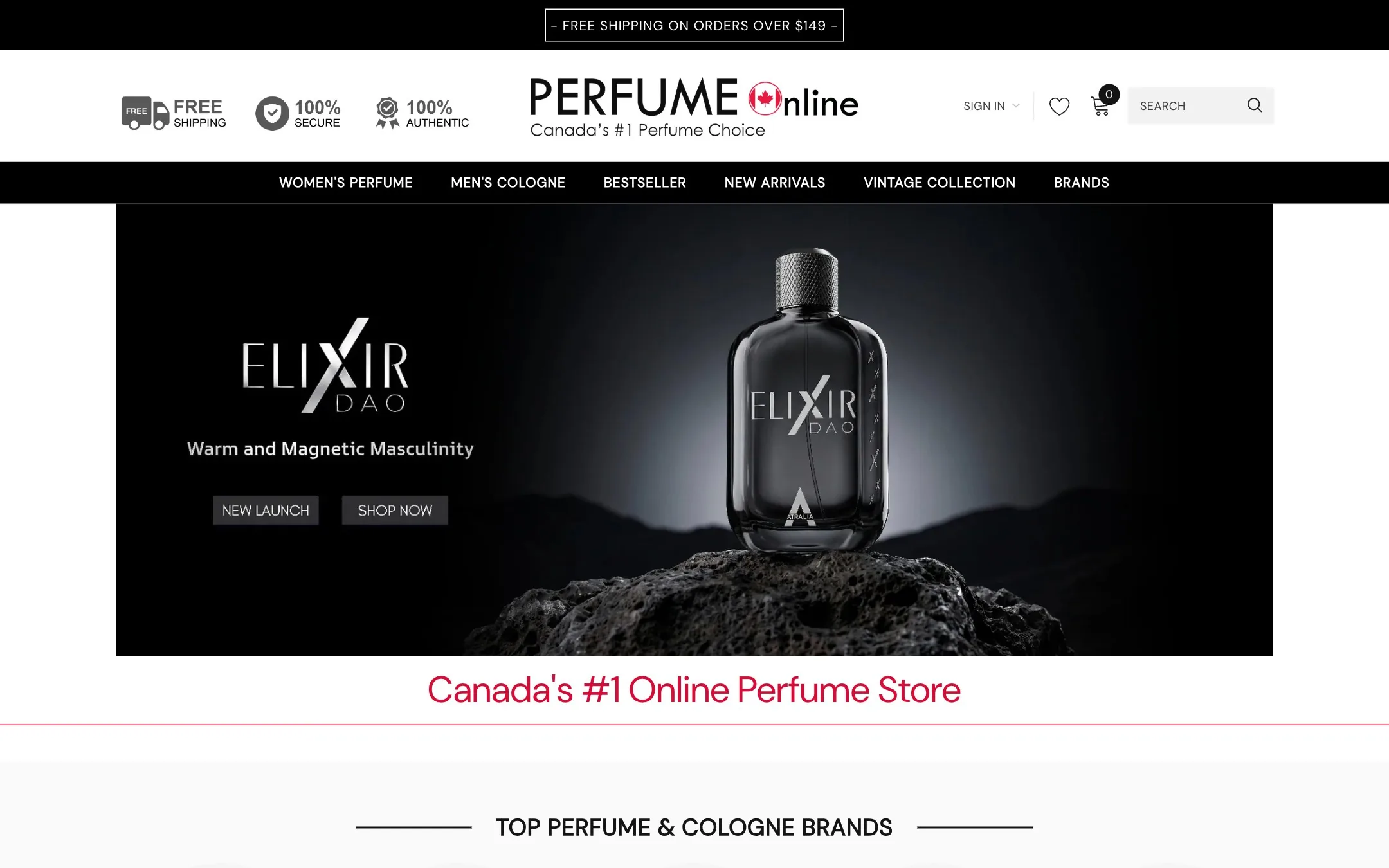
A second store is only cheaper if it is not a copy.
Running two fragrance storefronts in two countries invites the obvious shortcut: clone the first one, change the currency, ship it. That produces a store that technically works and locally reads as an import, which in a market the size of Canada is the difference between a destination and an afterthought.
So the build reuses the thinking and rebuilds the surface. The architecture carries over, because an A to Z brand index solves the same problem in any market where people shop fragrance by house. And everything a Canadian buyer actually touches is native: pricing in dollars they recognise, a shipping threshold set for this market, and a prompt for the visitor who arrived from the wrong side of the border.
"Canada's #1 Online Perfume Store." The store's own positioning line, top of the homepage
What travelled, and what did not.
The pair are easiest to understand side by side. One structural idea in common, and a market layer that is different all the way down.
- Currency
- US dollars
- Free shipping
- over $59
- Range focus
- Designer houses and Arabic perfumery
- Shared
- A to Z brand index
- Currency
- Canadian dollars
- Free shipping
- over $149
- Range focus
- Heritage, niche and a vintage archive
- Shared
- A to Z brand index
Five templates, built for one market.
Scroll through each page from top to bottom, or open it full size.

Homepage
Short by fragrance-retail standards, because every row below the hero is a route rather than a story.
- A designer house carousel straight after the hero
- New arrivals, best sellers and clearance as three rails
- Prices in Canadian dollars throughout
- Reviews at the bottom, not a trust badge wall

Brand index
The structural idea both stores share. Every house on one page, grouped A to Z, in four columns.
- Hundreds of houses, each one click from here
- Designer, niche and discontinued treated alike
- A page that absorbs new stock without redesign
- The same pattern running on the US store
Brand page
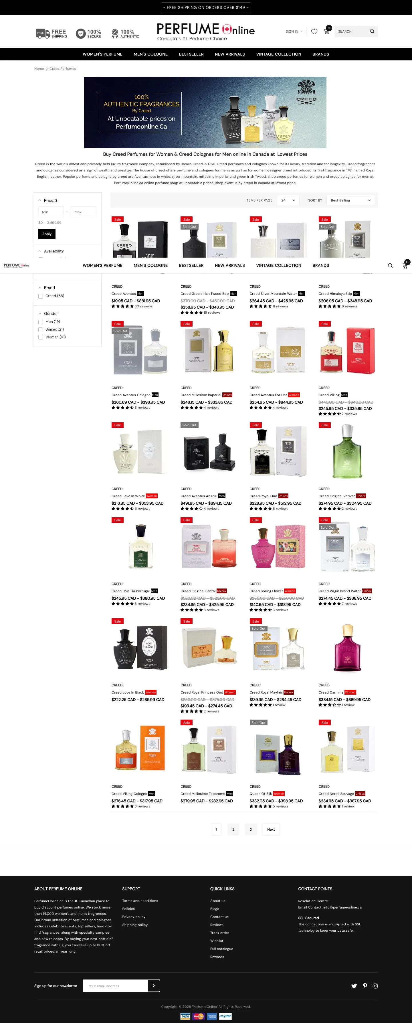
Every house gets a real page rather than a filtered view, because a brand name is the query people actually type.
- Written introduction above the grid
- An authenticity banner at the top of each house
- Filters scoped to that brand's stock
- Indexable in its own right, per house
Vintage archive
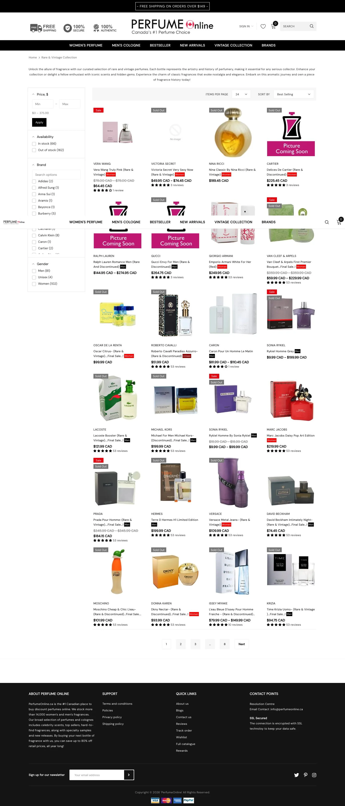
Discontinued and hard to find bottles, given their own collection rather than being scattered through the catalogue.
- A category a chain retailer cannot copy
- Out of stock lines kept visible, marked coming soon
- Its own entry in the main navigation
- The reason a collector bookmarks the store

Product page
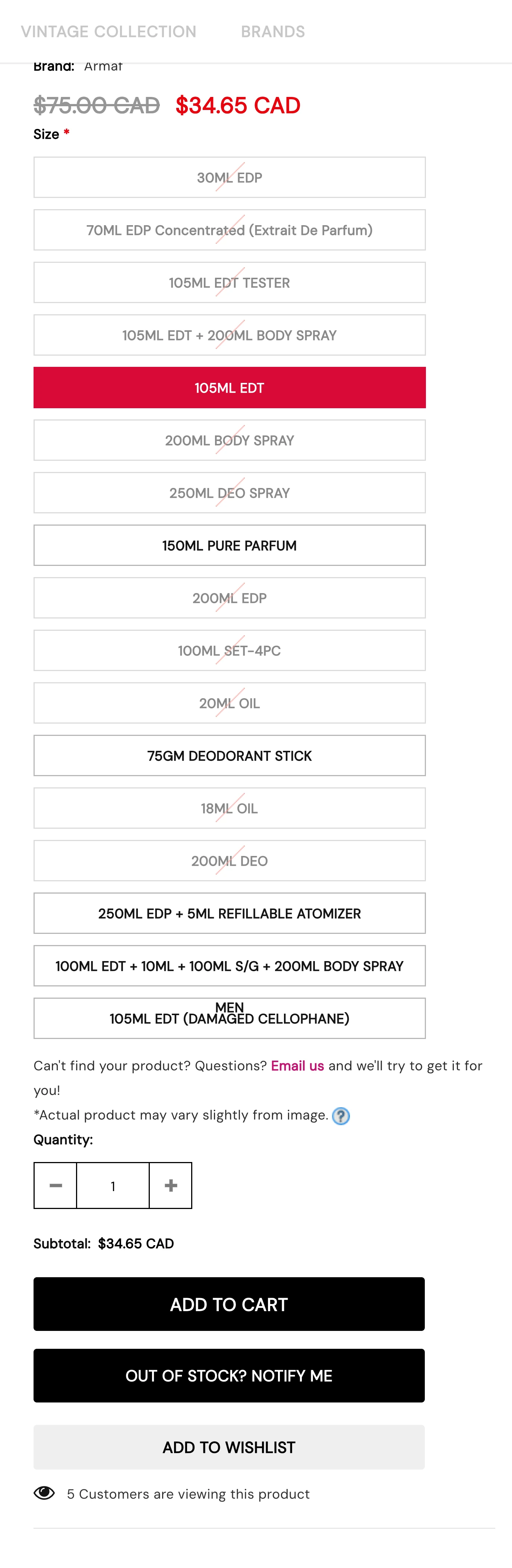
One fragrance, twenty ways to buy it. The variant problem on this catalogue is unusually severe.
- Every format listed, from 20ml oil to a 250ml set
- Price updates with the format chosen
- Out of stock lines offer a notify instead of hiding
- Reviews with customer photographs underneath
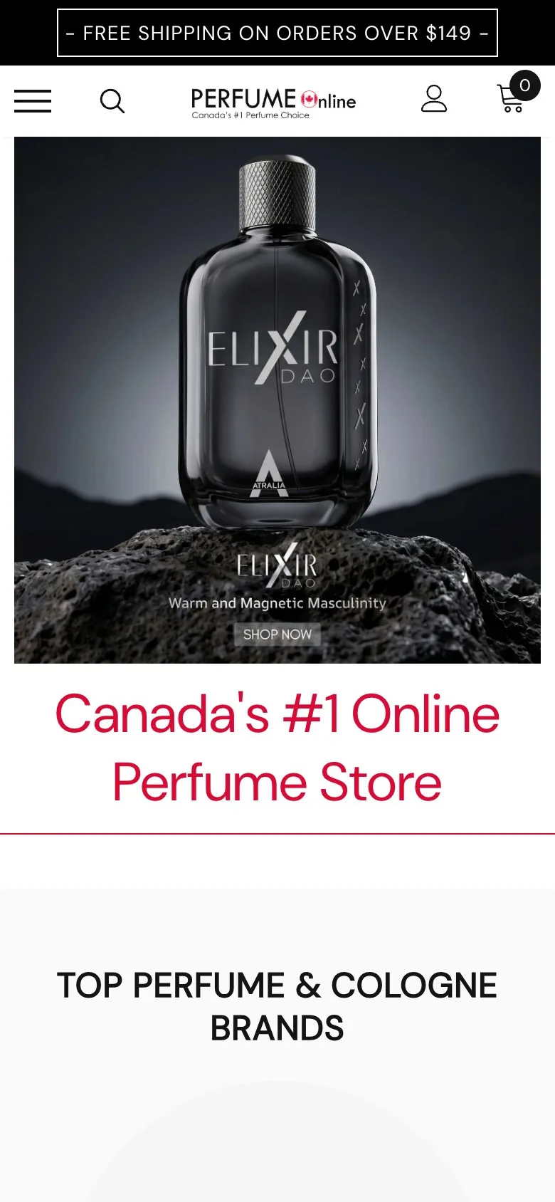
A long variant list, on a short screen.
Twenty formats and an A to Z index are both awkward on a phone, and both are load-bearing here.

Black, white, and one crimson.
A single grotesque, a near-black that is not quite black, and a crimson used only where something is selected or reduced. The bottles supply everything else.
Heritage houses, niche perfumery and a rare and vintage archive, with free shipping on orders over $149.
The pieces the store is built from.
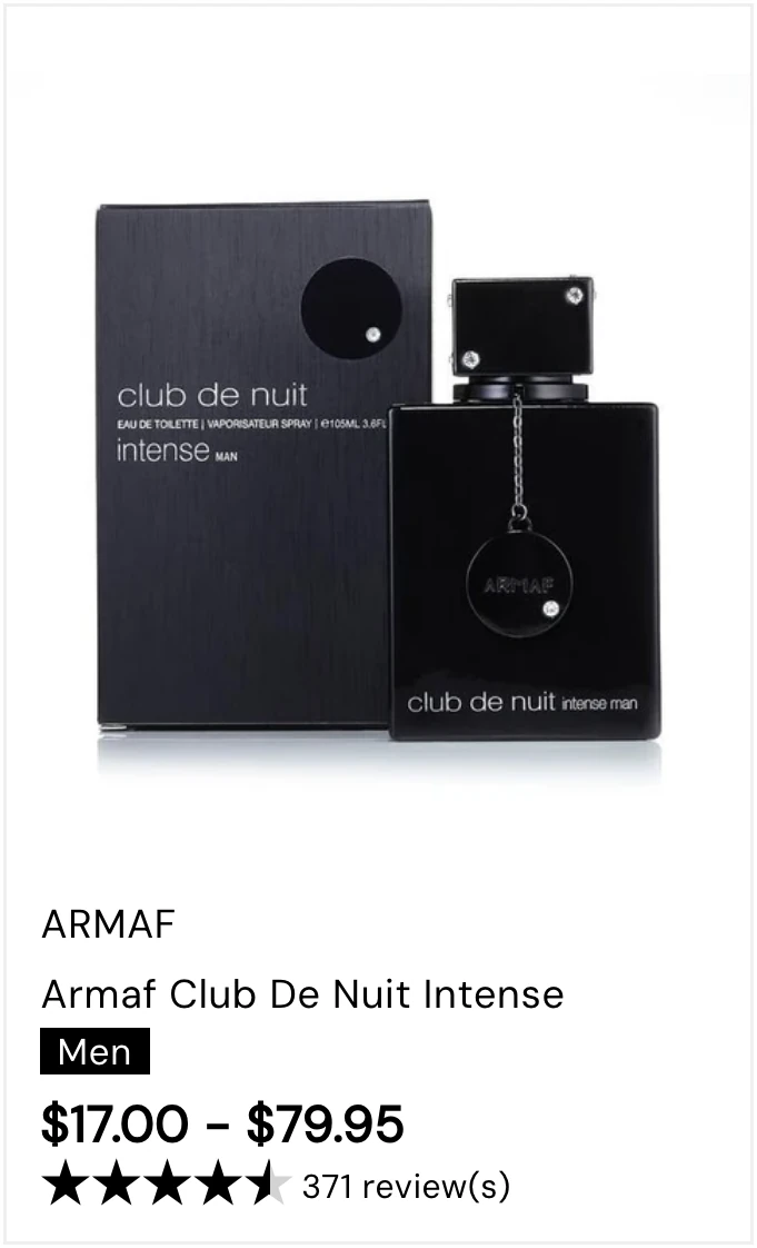
Every component below is a screenshot of the live store, not a mockup. The buy column is the one that had to absorb the most, because a single fragrance can carry twenty formats.


The work, at a glance.
- Shopify Plus storefront
- New store design and build
- A to Z brand index
- Brand landing pages
- Rare and vintage collection
- Multi-format variant handling
- Canadian pricing and shipping
- Back in stock notifications
- Reviews with customer photos
- Wishlist
Launching a second store in a second market?
Tell us what the first one runs on. The question is always which parts should be shared and which have to be local.
Schedule a Strategy Call